Paradigm
Your Guide to Using the Paradigm Template for Joomla
Introduction
Paradigm is a rich infusion of elegant, transparent visuals with a contemporary design frame, to create a subtle but invigorating site experience. The dynamically changing, transparent to opaque, fixed header, combines design and functionality.
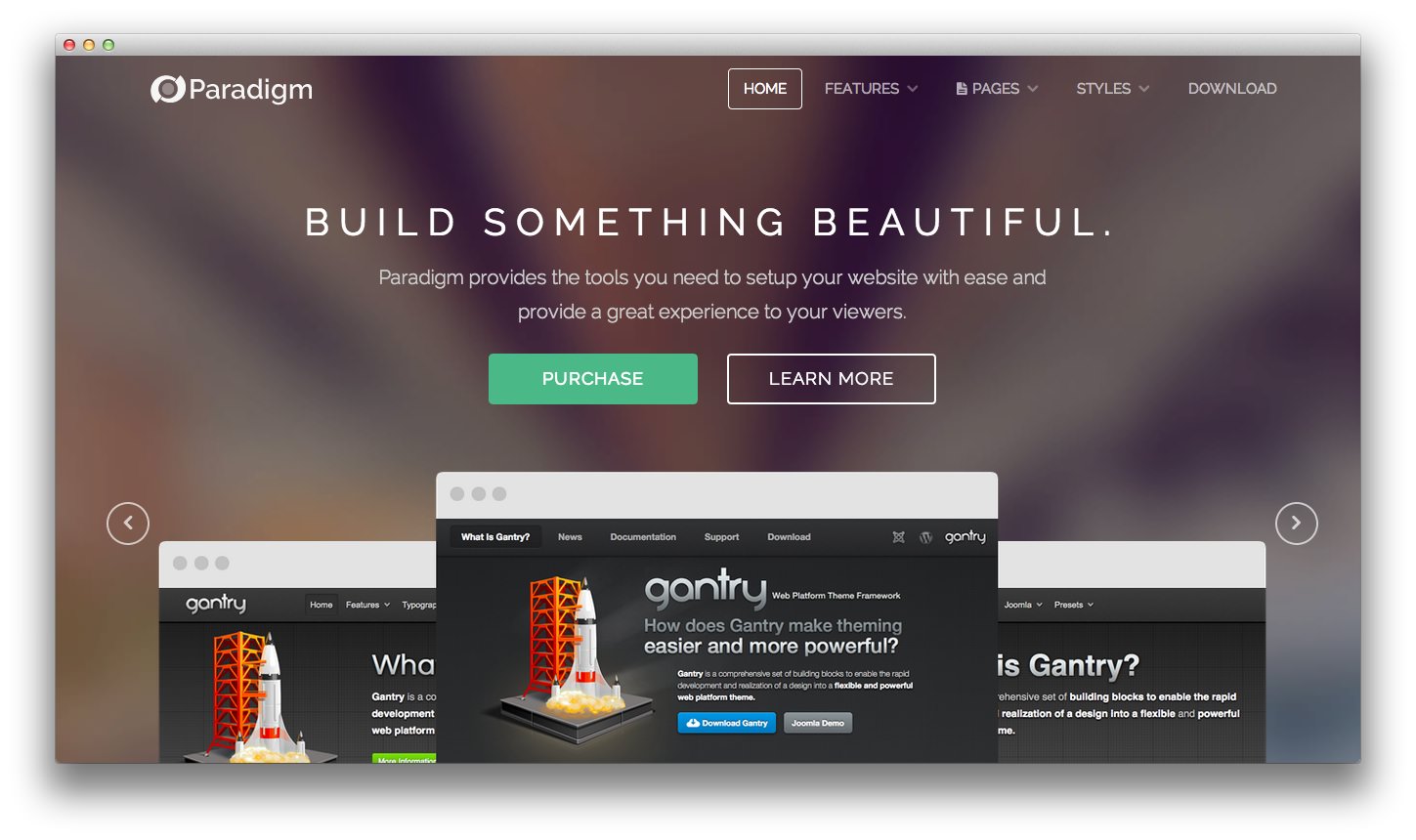
The template provides the tools you need to setup your website with ease and provide a great experience to your viewers, with its Gantry Framework and other standard features.
Requirements
- Apache 2.2+ or Microsoft IIS 7
- PHP 5.3.10+ (PHP 5.5+ Recommended)
- MySQL 5.1+
- Joomla 3.4
NOTE: Gantry v4.1.35 is required for Paradigm to work correctly. For more details on the Gantry Framework, please visit its dedicated website.
Key Features
- Joomla 3.x Compatible
- Responsive Layout
- 8 Preset Styles
- 88 Module Positions
- 8 Styled & Numerous Structural Module Suffixes
- RokSprocket Integrated Styling
- Optimized for RokBooster
- HTML5 Canvas Charts (Modern browsers & IE9+)
- Powerful Gantry 4 Framework
- DropDown Menu & Splitmenu
- Custom Content Typography
- FF, Safari, Chrome, Opera, IE8+ Compatible
- HTML5, CSS3, LESS CSS
Comprehensive Color Chooser
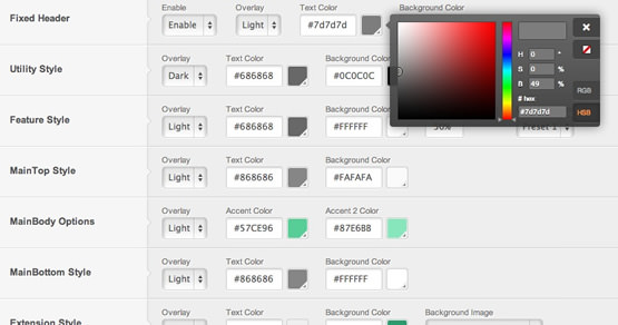
Paradigm has an extensive Color Chooser in the template manager to provide intricate controls for each section of Paradigm, inclusive of overlay type, text color, accent colors, background color, background opacity and/or background image.
Responsive Layout
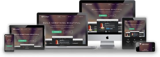
Paradigm's responsive grid system is designed for desktop, tablet and smartphone systems, each with minor modifications to ensure compatibility in each mode.
The table below shows the breakdown of screen resolutions and associated devices, and which layout characters are then applied to each.
| Label | Description | Layout Width | Column Width |
|---|---|---|---|
| Smartphones | Standard smartphones | 480px and below | 100% fluid |
| Smartphones to Tablets | Larger smartphones and small tablets | 767px and below | 100% fluid |
| Tablets | Larger tablets | 768px and above | 64px |
| Desktop | Standard desktops and laptops | 960px and above | 80px |
| Large Display | Large desktops and high-resolution laptops | 1200px and above | 100px |