Paradigm: Recreating the Demo - Responsive Design
Your Guide to Recreating Elements of the Paradigm Demo for Joomla
Responsive Design
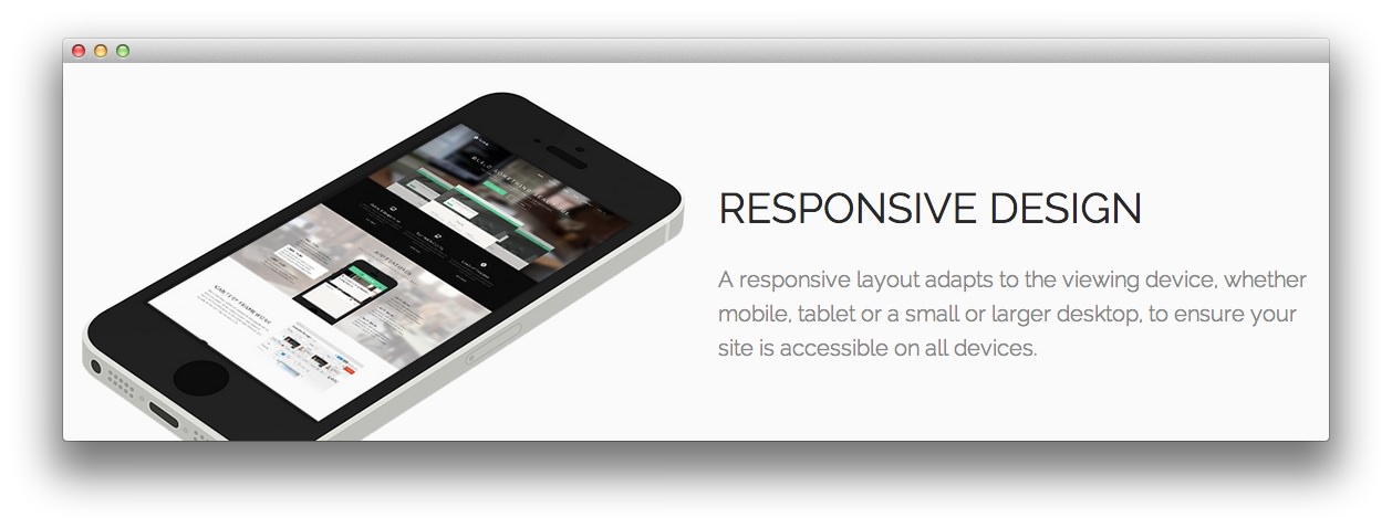
This area of the front page is a Custom HTML module. You will find the settings used in our demo below. Due to the hidden-phone Module Class Suffix setting, this module will not appear on mobiles.
Any mod_custom (Custom HTML) modules are best handled using either RokPad or no editor as a WYSIWYG editor can cause issues with any code that exists in the Custom Output field.
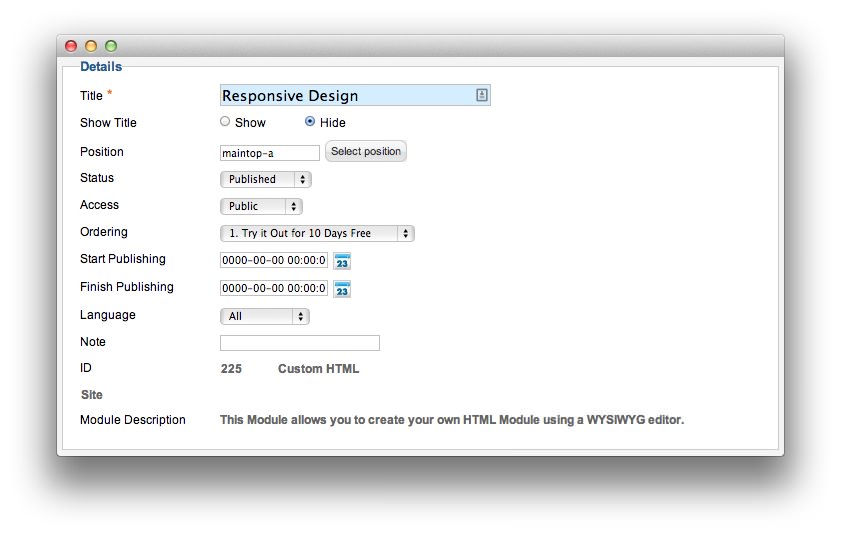
Details
| Option | Setting |
|---|---|
| Title | Responsive Design |
| Show Title | Hide |
| Position | maintop-a |
| Status | Published |
| Access | Public |
| Language | All |
| Note | Blank |
Custom Output
Enter the following in the Custom Output text editor.
<div class="gantry-width-block gantry-width-50">
    <div class="gantry-width-spacer nomarginbottom">
        <img src="/images/rocketlauncher/frontpage/maintop/img2.png" alt="img" />
    </div>
</div>

<div class="gantry-width-block gantry-width-50">
    <div class="gantry-width-spacer">
        <div class="rt-maintop-desc">
            <div class="module-title">
              <h2 class="title">Responsive <span class="hidden-tablet">Design</span></h2>
            </div>
            <p class="rt-large-text">
                A responsive layout adapts to the viewing device<span class="hidden-tablet">, whether mobile, tablet or a small or larger desktop, to ensure your site is accessible on all devices</span>.</span>
            </p>
        </div>
    </div>
</div>

<div class="clear"></div>
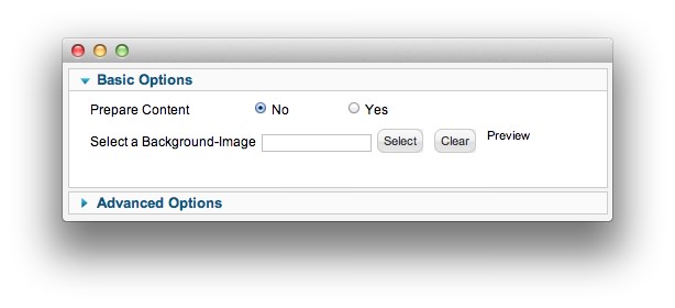
Basic
| Option | Setting |
|---|---|
| Prepare Content | No |
| Select a Background Image | Blank |
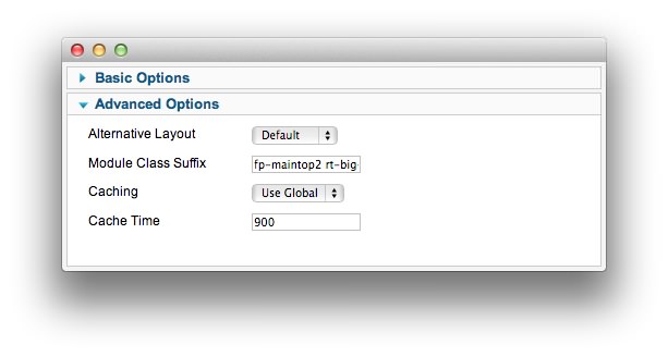
Advanced
| Option | Setting |
|---|---|
| Module Class Suffix | fp-maintop2 rt-big-title nomarginbottom nopaddingbottom hidden-phone |
Found errors? Think you can improve this documentation? Please edit this page. You can also view the history of this page.