Reflex: Recreating the Demo - Footer
Your Guide to Recreating Elements of the Reflex Theme for WordPress
Footer Section
-
 1Text 12Text 23Text 34RokGallery5Text 4
Here is the widget breakdown for the Footer section:
- Text
- Text
- Gantry Divider
- Text
- Gantry Divider
- RokGallery
- Text
Text 1
This section of the page is a standard text widget. You will need to enter the following in the main text field.
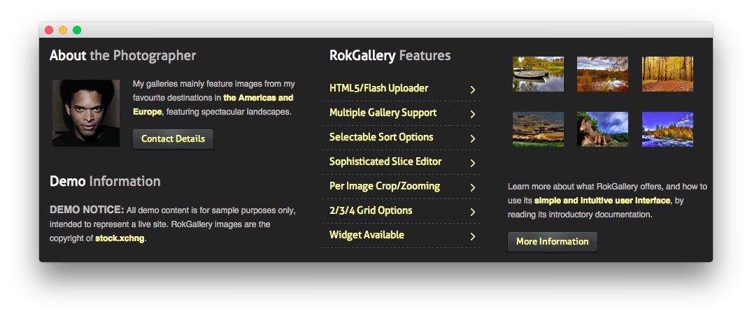
<div class="rg-gm-slice floatleft"><img class="" src="http://demo.rockettheme.com/live/wordpress/reflex/wp-content/rockettheme/rt_reflex_wp/frontpage/photo1.jpg" alt="Image" height="96" width="96"/></div>
<p>My galleries mainly feature images from my favourite destinations in <a href="#">the Americas and Europe</a>, featuring spectacular landscapes.</p>
<a href="#" class="readon"><span>Contact Details</span></a>
Here is a breakdown of options changes you will want to make to match the demo.
- Enter
About the Photographeras the Title - Enter
nomarginbottom nopaddingbottom nopaddingleftin the Custom Variations field. - Leaving everything else at its default setting, select Save.
Gantry Divider
This widget tells WordPress to start a new widget column beginning with the widget placed directly below the divider in the section.
Text 2
This section of the page is a standard text widget. You will need to enter the following in the main text field.
<p><em class="bold">DEMO NOTICE:</em> All demo content is for sample purposes only, intended to represent a live site. RokGallery images are the copyright of <a target="_blank" href="http://www.sxc.hu/">stock.xchng</a>.</p>
Here is a breakdown of options changes you will want to make to match the demo.
- Enter
Demo Informationas the Title - Enter
nopaddingleftin the Custom Variations field. - Leaving everything else at its default setting, select Save.
Text 3
This section of the page is a standard text widget. You will need to enter the following in the main text field.
<ul class="menu">
<li class="item195">
                <a href="#">
            <span class="menuitem">HTML5/Flash Uploader</span>
            </a>
                    </li>
                <li class="item196">
                <a href="#">
            <span class="menuitem">Multiple Gallery Support</span>
            </a>
                    </li>
                <li class="item197">
                <a href="#">
            <span class="menuitem">Selectable Sort Options</span>
            </a>
                    </li>
                <li class="item198">
                <a href="#">
            <span class="menuitem">Sophisticated Slice Editor</span>
            </a>
                    </li>
                <li class="item199">
                <a href="#">
            <span class="menuitem">Per Image Crop/Zooming</span>
            </a>
                    </li>
                <li class="item200">
                <a href="#">
            <span class="menuitem">2/3/4 Grid Options</span>
            </a>
                    </li>
                <li class="item201">
                <a href="#">
            <span class="menuitem">Widget Available</span>
            </a>
                    </li>
</ul>
Here is a breakdown of options changes you will want to make to match the demo.
- Enter
RokGallery Featuresas the Title - Enter
nopaddingleftin the Custom Variations field. - Leaving everything else at its default setting, select Save.
RokGallery (Grid)
This RokGallery widget is used to display a Grid of images in order to demonstrate what RokGallery can do to enhance your site's look.
Here is a breakdown of the widget options:
| Option | Setting |
|---|---|
| Title | |
| Link Type | Link to RokBox Slice Image |
| Default Linked Item | Home |
| Show Title | No |
| Show Caption | No |
| Sort By | Title |
| Sort Direction | Ascending |
| Slice Limit | 6 |
| Gallery Style | Dark |
| Gallery Layout | Grid Layout |
| Grid Columns | 3 |
This will create the widget, but you will need to actually build the gallery using RokGallery. We go into detail on how to use RokGallery in our official guide.
Text 4
This section of the page is a standard text widget. You will need to enter the following in the main text field.
<p>Learn more about what RokGallery offers, and how to use its <a href="#">simple and intuitive user interface</a>,  by reading its introductory documentation.</p>
<a href="#" class="readon"><span>More Information</span></a>
Here is a breakdown of options changes you will want to make to match the demo.
- Enter
nopaddingright nomargintop nopaddingtopin the Custom Variations field. - Leaving everything else at its default setting, select Save.