Ricochet: Recreating the Demo - From Our Blog
Your Guide to Recreating Elements of the Ricochet Demo for Joomla
From Our Blog
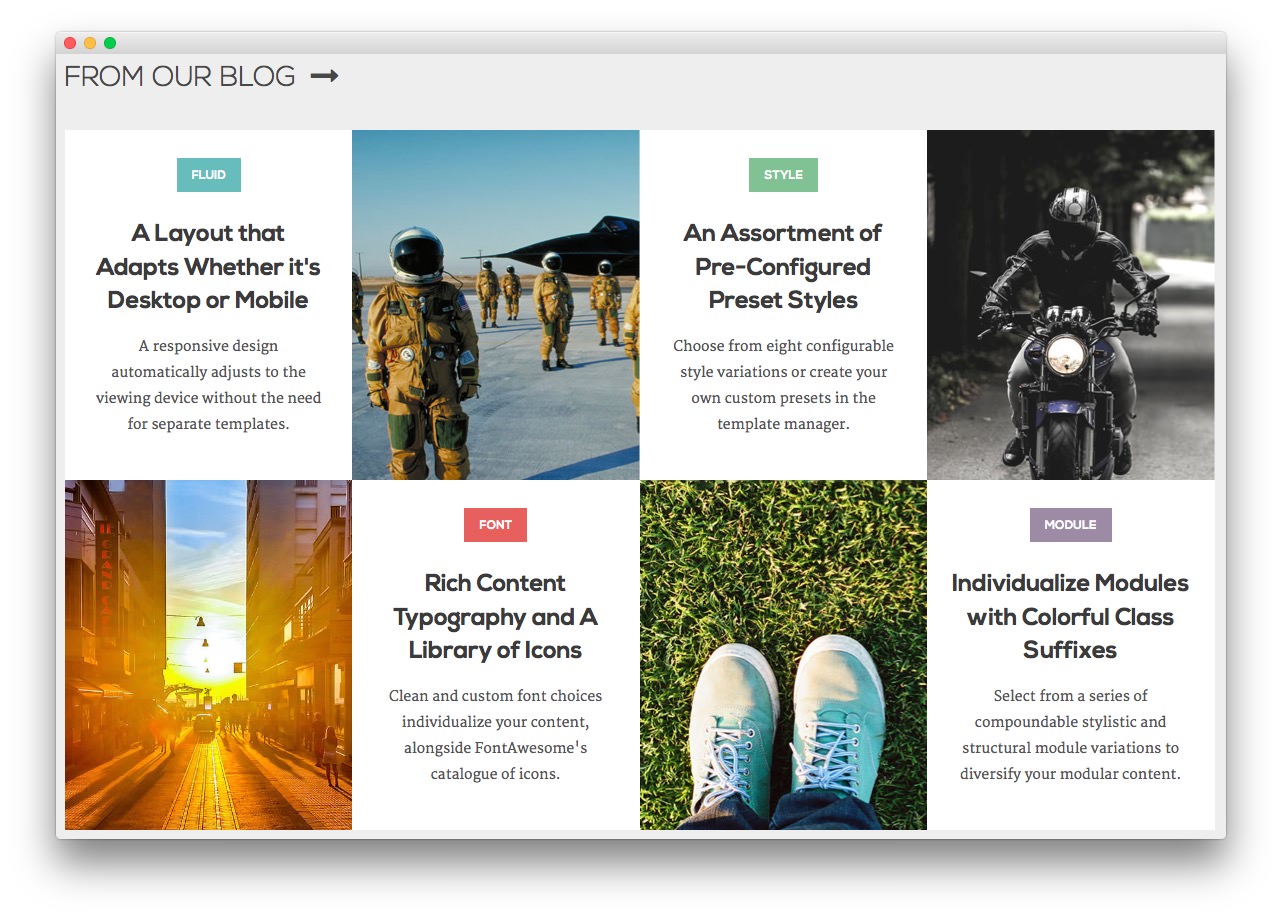
This area of the page is a RokSprocket module utilizing the Simple content provider and the Grids layout.
The settings used in our demo are listed below.
Details
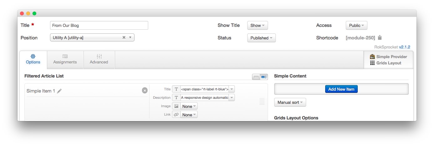
| Option | Setting |
|---|---|
| Title | From Our Blog |
| Show Title | Show |
| Access | Public |
| Position | utility-a |
| Status | Published |
| Content Provider | Simple |
| Layout Mode | Grids |
Simple Content Provider
The Title and Description fields in each item have been altered. A few examples of these article changes can be found below.
Article 1
Title
<span class="rt-label rt-blue">Fluid</span><br /><span class="rt-grid-title">A Layout that Adapts<span class="hidden-tablet"> Whether <span class="visible-large">it's </span>Desktop or Mobile</span></span>
Description
A responsive design automatically adjusts to the viewing device without the need for separate templates.
Article 2
The second item has a custom image in the Image field. This enables the grid item to show up as an image with the Description appearing as you move your mouse cursor over it.
Title
<span class="rt-label">Menu</span><br /><span class="rt-grid-title">Multiple Menu Types to <span class="hidden-tablet">Select and </span>Configure</span>
Description
The options available are either the Dropdown Menu, or Splitmenu. Each have mobile menu support.
Article 3
Title
<span class="rt-label rt-green">Style</span><br /><span class="rt-grid-title">An Assortment of <span class="hidden-tablet"> Pre-Configured</span> Preset Styles</span>
Description
Choose from eight configurable style variations or create your own custom presets in the template manager.
Layout Options
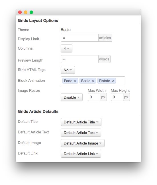
| Option | Setting |
|---|---|
| Theme | Basic |
| Display Limit | ∞ |
| Columns | 4 |
| Preview Length | ∞ |
| Strip HTML Tags | No |
| Block Animation | Fade, Scale, Rotate |
| Image Resize | Disable |
| Default Title | Default Article Title |
| Default Article Text | Default Article Text |
| Default Article Image | Default Article Image |
| Default Link | Default Article Link |
Advanced
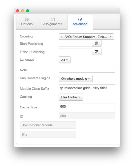
| Option | Setting |
|---|---|
| Module Class Suffix | fp-roksprocket-grids-utility title5 |
Found errors? Think you can improve this documentation? Please edit this page. You can also view the history of this page.