Versla: Info List Particle
Your Guide to Recreating Elements of the Versla Demo for WordPress
Introduction
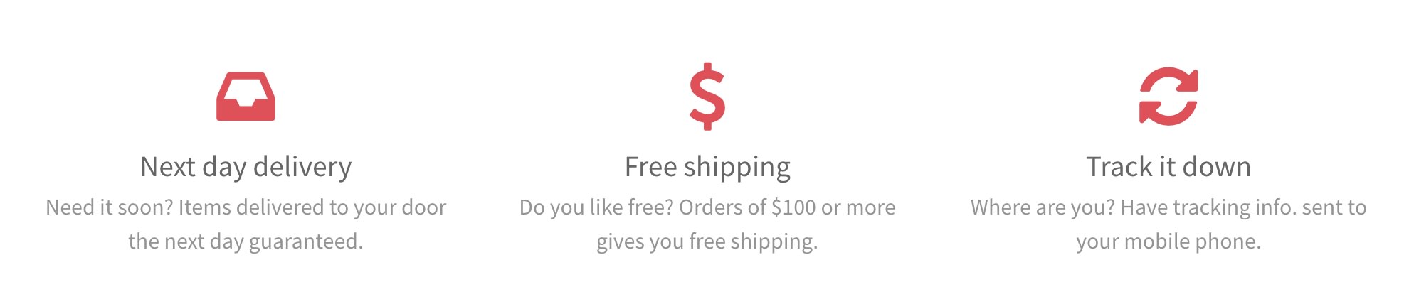
The Info List particle is an excellent choice for any situation where you want to create a content block that lists features and other tidbits of information.
Here are the topics covered in this guide:
Configuration
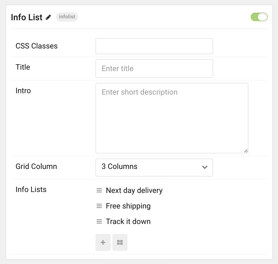
Main Options
These options affect the main area of the particle, and not the individual items within. You can set the title of the particle, as well as give it an introductory paragraph here.
| Option | Description |
|---|---|
| CSS Classes | Set the CSS class(es) you would like to have apply at the particle level. |
| Title | Enter the title of the particle you would like to have appear on the front end. |
| Intro | Enter introductory text for the particle. This appears below the title. |
| Grid Column | Set the number of columns you want items to appear in. |
Item Options
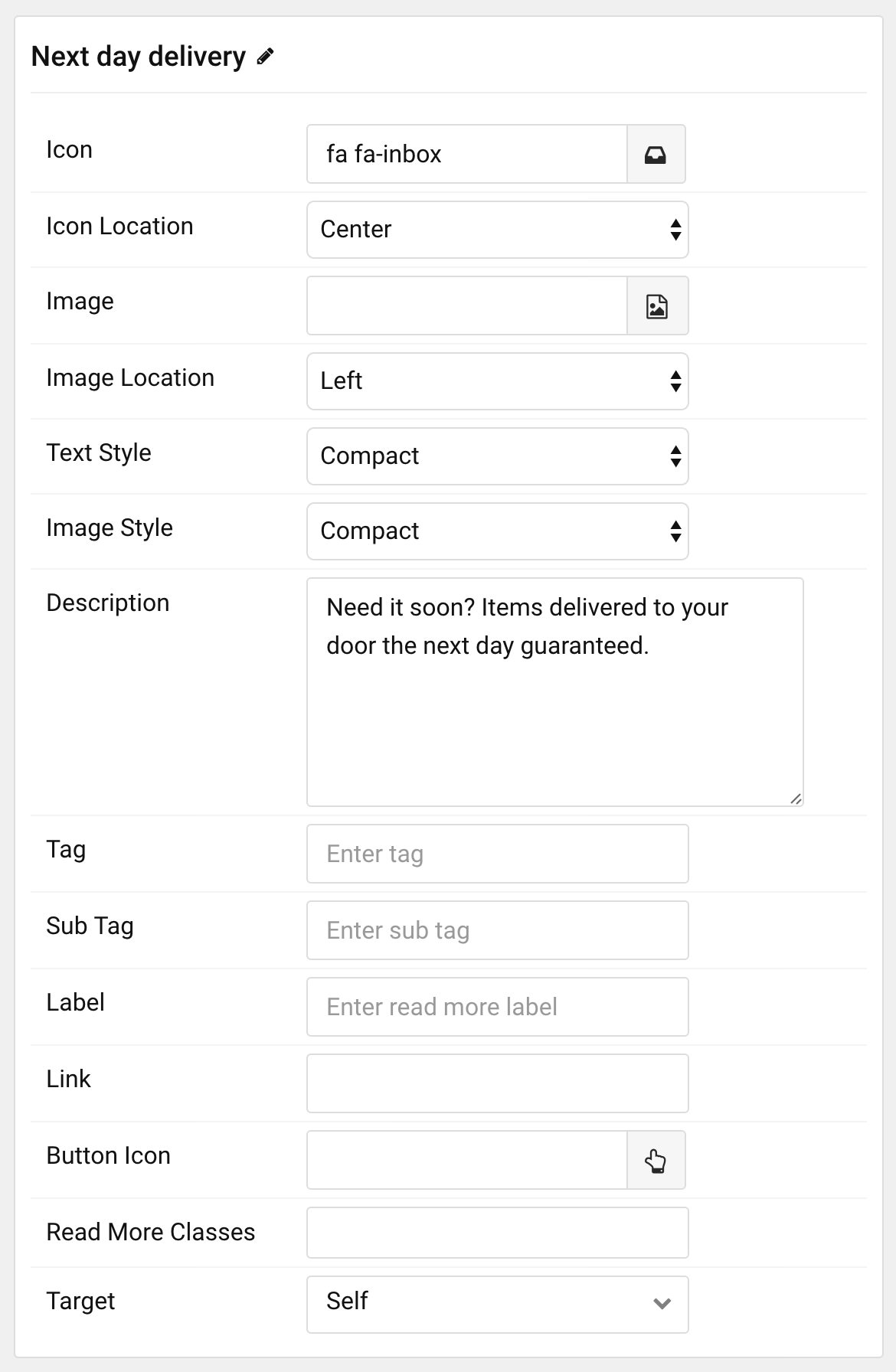
These items make up the individual featured items in the particle. They sit apart from the particle's title and introduction. Each item can have its own properties, including icons and written content.
| Option | Description |
|---|---|
| Name | The name of the item is what appears below the icon on the front end. This is in contrast to most particles where the individual item name only appears on the back end. |
| Icon | Sets the primary icon for the item. |
| Icon Location | Assign the icon a location relative to the rest of the item. You can set this to Left, Center, or Right. |
| Image | Assign an image to the item. |
| Image Location | Assign the image a location relative to the rest of the item. You can set this to Left, Center, or Right. |
| Text Style | Set the style you would like the text to appear in. You can set this to Compact, Large, Bold, or Header. |
| Image Style | Set the image style determining how the item's image appears. This can be set to Compact, Large, Browser, or Avatar. |
| Description | Enter descriptive text for the item. |
| Tag | Customize the tag for the item. |
| Sub Tag | Customize the subtag for the item. |
| Label | Enter text you would like to have appear as the Read More link label. |
| Link | Enter the URL you would like to have the item link to. |
| Button Icon | If you would like to have an icon represent the read more button, this is where you would select it. |
| Read More Classes | Enter the CSS class(es) you would like to have apply to the individual item. |
| Target | Sets the target for the item's link. You can choose to have it open as Self in the same tab, or New Window in a new tab. |
Found errors? Think you can improve this documentation? Please edit this page. You can also view the history of this page.