Tessellate: Recreating the Demo - Showcase
Your Guide to Recreating Elements of the Tessellate Theme for WordPress
Showcase Section
-
 1Text 12Text 23Text 34RokSprocket (Tabs)
Here is the widget breakdown for the Showcase section:
- Text
- Gantry Divider
- Text
- Gantry Divider
- Text
- RokSprocket (Tabs)
Text 1
This section of the page is a standard text widget. You will need to enter the following in the main text field.
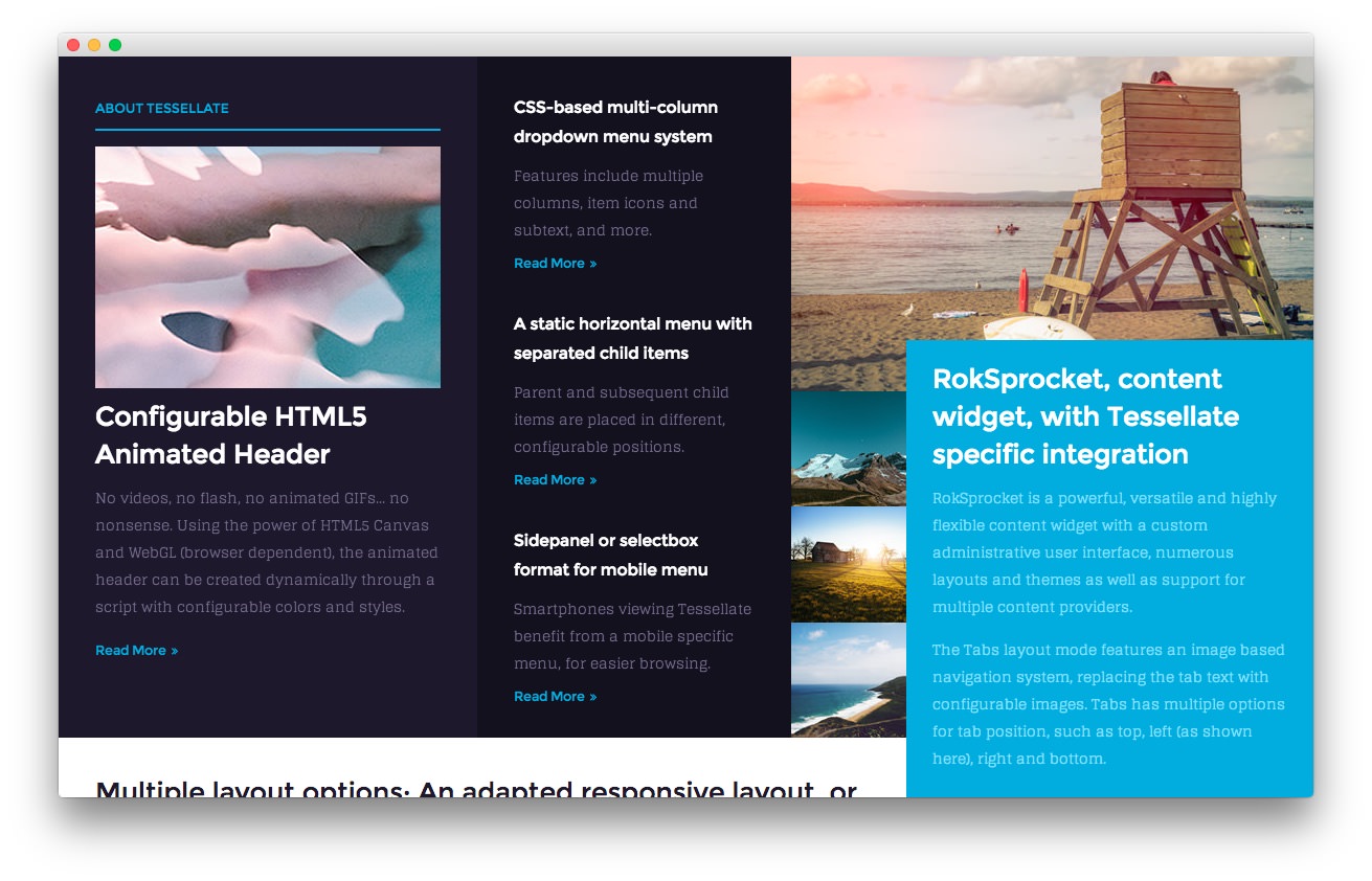
<img src="http://(your url)/wordpress/tessellate2/wp-content/rockettheme/rt_tessellate_wp/home/fp-showcase-a/img-01.jpg" alt="image" />

<h3>Configurable HTML5 Animated Header</h3>

<p class="hidden-tablet"><span><span class="visible-large">No videos, no flash, no animated GIFs... no nonsense.</span> Using <span class="visible-large">the power of </span>HTML5 Canvas and WebGL (browser dependent), the animated header can be created dynamically<span class="visible-large"> through a script</span> with configurable colors<span class="visible-large"> and styles</span></span>.</p>

<p class="visible-tablet">HTML5 Canvas powered animated header.</p>

<a href="http://(your url)/wordpress/tessellate2/features-overview/" class="readon4">Read More</a>
Here is a breakdown of options changes you will want to make to match the demo.
- Set the Title to
About Tessellate. - Switch the Widget Variations option to Title 1.
- Enter
fp-showcase-ain the Custom Variations field. - Leaving everything else at its default setting, select Save.
Gantry Divider
This widget tells WordPress to start a new widget column beginning with the widget placed directly below the divider in the section.
Text 2
This section of the page is a standard text widget. You will need to enter the following in the main text field.
<div class="hidden-tablet">
    <h6><span>CSS-based <span class="visible-large">multi-column </span>dropdown menu system</span></h6>
    <p class="smallmarginbottom hidden-tablet">Features include multiple columns, item icons and subtext, and more.</p>
    <a href="http://(your url)/wordpress/tessellate2/menu-options/" class="readon4">Read More</a>

    <h6 class="largemargintop largepaddingtop"><span>A static horizontal menu <span class="hidden-large">option</span><span class="visible-large"> with separated child items</span></span></h6>
    <p class="smallmarginbottom hidden-tablet">Parent and subsequent child items are placed in different, configurable positions.</p>
    <a href="http://(your url)/wordpress/tessellate2/menu-options/" class="readon4">Read More</a>
</div>

<div class="visible-large">
    <h6 class="largemargintop largepaddingtop">Sidepanel or selectbox format for mobile menu</h6>
    <p class="smallmarginbottom">Smartphones viewing Tessellate benefit from a mobile specific menu, for easier browsing.</p>
    <a href="http://(your url)/wordpress/tessellate2/menu-options/" class="readon4">Read More</a>
</div>

<div class="visible-tablet">
    <h6>CSS-based multi-column dropdown menu system</h6>
    <a href="http://(your url)/wordpress/tessellate2/menu-options/" class="readon4">Read More</a>

    <h6 class="largemargintop largepaddingtop">A static horizontal menu with separated child items</h6>
    <a href="http://(your url)/wordpress/tessellate2/menu-options/" class="readon4">Read More</a>
</div>
Here is a breakdown of options changes you will want to make to match the demo.
- Enter
fp-showcase-bin the Custom Variations field. - Leaving everything else at its default setting, select Save.
Text 3
This section of the page is a standard text widget. You will need to enter the following in the main text field.
<img src="http://(your url)/wordpress/tessellate2/wp-content/rockettheme/rt_tessellate_wp/home/fp-showcase-c/img-01.jpg" alt="image" />
Here is a breakdown of options changes you will want to make to match the demo.
- Switch the Widget Variations option to No Padding All, No Margin All.
- Enter
fp-showcase-cin the Custom Variations field. - Leaving everything else at its default setting, select Save.
RokSprocket
You will need to do two things to prepare this widget so that it looks similar to the one in the demo.
First, you will need to create the RokSprocket Widget. You can do this by navigating to Administration -> RokSprocket Admin and creating a new Tabs widget.
You can find out more about RokSprocket and how to set up and modify widgets by visiting our RokSprocket documentation.
Simple Content Provider
We used the Simple Content Provider to allow us to make custom tabs without having to build posts on the back-end. In this case, the Tab Label and Description are custom, while the other options are left at default or None settings. You will find the settings used in one of these items below.
Tab Label
<img src="http://(your url)/wordpress/tessellate2/wp-content/rockettheme/rt_tessellate_wp/home/fp-roksprocket-tabs-showcase/img-01.jpg" alt="image" />
Description
<h3><span>RokSprocket<span class="hidden-tablet">, content</span> widget, with Tessellate <span class="visible-large">specific</span> integration</span></h3>

<p class="hidden-tablet"><span>RokSprocket is a powerful, versatile and highly flexible content widget with a custom administrative user interface<span class="visible-large">, numerous layouts and themes as well as support for multiple content providers</span>.</span></p>

<p class="hidden-tablet"><span>The Tabs layout mode features an image based navigation system, replacing the tab text with configurable images. <span class="visible-large">Tabs has multiple options for tab position, such as top, left (as shown here), right and bottom.</span></span></p>

<p class="visible-tablet">RokSprocket is a versatile content widget with a custom UI.</p>

<p class="visible-tablet">The Tabs layout mode features an image based navigation system.</p>
Here is a look at the Tabs Layout Options for this widget.
| Option | Setting |
|---|---|
| Theme | Default |
| Display Limit | ∞ |
| Tabs Position | Left |
| Animation | Fade |
| Autoplay | Disable |
| Autoplay Delay | 5 |
| Image Resize | Disable |
| Preview Length | 0 |
| Strip HTML Tags | No |
You can set the RokSprocket filters to include any category, specific posts, or otherwise you would like to have featured in this widget.
Once you have created this widget, you can add it via the Widgets menu by clicking RokSprocket and dragging it to the appropriate section. When you have done this, you will need to complete the following.
- Select your RokSprocket Tabs widget in the Choose Widget field.
- Enter
fp-roksprocket-tabs-showcasein the Custom Variations field. - Leaving everything else at its default setting, select Save.
The widget should now be created and ready for use on the front page of your WordPress site.