Protean: Flipster Cover Flow Particle
Your Guide to Recreating Elements of the Protean Demo for WordPress
Introduction
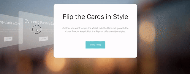
The Flipster particle enables you to create a cover flow-style series of informational cards to your site. This is a great way to showcase information that you would like your visitors to know. It's a modern take on the traditional tabbed content block.
Here are the topics covered in this guide:
Configuration
Main Options
These options affect the main area of the particle, and not the individual items within.
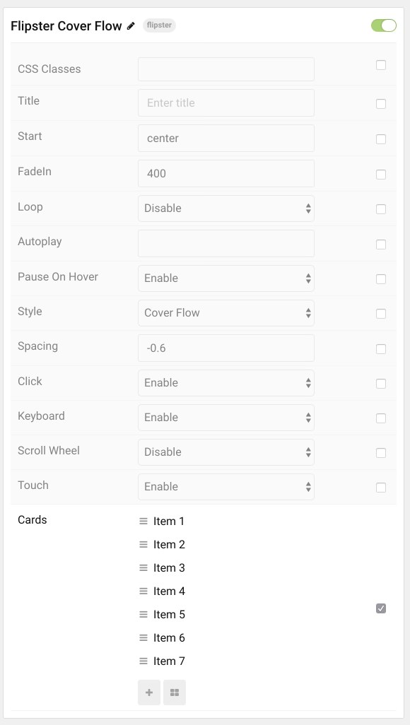
| Option | Description |
|---|---|
| Particle Name | Enter the name you would like to assign to the particle. This only appears in the back end. |
| CSS Classes | Sets any CSS class(es) you would like to have apply to the particle. |
| Title | Creates a title for the particle that appears on the front end. |
| Start | Set the starting position for the particle as it loads. This is a zero-based index, with center being the middle. |
| FadeIn | Sets the speed of the FadeIn affect when switching between items. |
| Loop | Enables you to loop around when the start or end is reached. |
| Autoplay | Sets autoplay (in milliseconds). Setting 0 or leaving the field blank disables. |
| Pause on Hover | Pauses autoplay when you hover over the particle. |
| Style | Sets the style for the particle. Options include: Cover Flow, Carousel, Flat, and Wheel. |
| Spacing | Sets the spacing between the cards. |
| Click | Enables you to switch between items by clicking them. |
| Keyboard | Enables left/right arrow navigation. |
| Scroll Wheel | Enables scroll wheel navigation. |
| Touch | Enables touch navigation for tablets and smartphones. |
Item Options
These items make up the individual featured items in the particle.
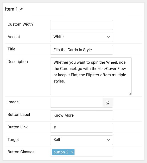
| Option | Description |
|---|---|
| Item Name | Designates a name for the item that appears in the back end only. |
| Custom Width | Set a custom width for the item here. |
| Accent | Sets an accent color for the item. |
| Title | Add a title to the item here. |
| Description | Add a description to the item here. |
| Image | Add an image to the item here. |
| Button Label | Sets a label (text) that appears on the button. |
| Button Link | Sets a link for the button. |
| Target | Sets a target for the button's link. This could be self or new window. |
| Button Classes | Sets CSS class(es) to the buttons. |
Found errors? Think you can improve this documentation? Please edit this page. You can also view the history of this page.