Praxis: Recreating the Demo - Utility
Your Guide to Recreating Elements of the Praxis Theme for WordPress
Utility Section
Here is the widget breakdown for the Utility section:
- Text
Text
This section of the page is a standard text widget. You will need to enter the following in the main text field.
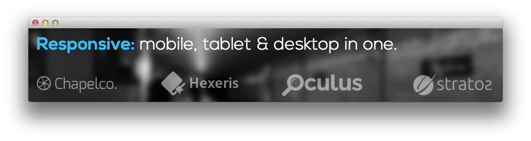
<div class="hidden-phone">
<p class="largemargintop"><span class="promo2"><strong><a href="http://demo.rockettheme.com/wordpress-themes/wp_praxis/features/">Responsive:</a></strong> mobile, tablet & desktop in one.</span></p>
<div class="largemargintop largemarginbottom largemarginright largepaddingtop">
<div class="gantry-width-25 gantry-width-block"><div class="largemarginright">
<img class="rt-utility-img" alt="image" src="http://demo.rockettheme.com/wordpress-themes/wp_praxis/wp-content/rockettheme/rt_praxis_wp/frontpage/utility/img1.png" />
</div></div>
<div class="gantry-width-25 gantry-width-block"><div class="largemarginright">
<img class="rt-utility-img" alt="image" src="http://demo.rockettheme.com/wordpress-themes/wp_praxis/wp-content/rockettheme/rt_praxis_wp/frontpage/utility/img2.png" />
</div></div>
<div class="gantry-width-25 gantry-width-block"><div class="largemarginright">
<img class="rt-utility-img" alt="image" src="http://demo.rockettheme.com/wordpress-themes/wp_praxis/wp-content/rockettheme/rt_praxis_wp/frontpage/utility/img3.png" />
</div></div>
<div class="gantry-width-25 gantry-width-block"><div class="largemarginleft">
<img class="rt-utility-img" alt="image" src="http://demo.rockettheme.com/wordpress-themes/wp_praxis/wp-content/rockettheme/rt_praxis_wp/frontpage/utility/img4.png" />
</div></div>
<div class="clear"></div>
</div>
</div>
<div class="visible-phone rt-center">
<p class="largemargintop"><span class="promo2"><strong><a href="http://demo.rockettheme.com/wordpress-themes/wp_praxis/features/">Responsive:</a></strong> mobile, tablet & desktop in one.</span></p>
<div class="largemargintop largemarginbottom largemarginright largepaddingtop">
<img class="rt-utility-img" alt="image" src="http://demo.rockettheme.com/wordpress-themes/wp_praxis/wp-content/rockettheme/rt_praxis_wp/frontpage/utility/img1.png" /><br />
<img class="rt-utility-img" alt="image" src="http://demo.rockettheme.com/wordpress-themes/wp_praxis/wp-content/rockettheme/rt_praxis_wp/frontpage/utility/img2.png" /><br />
<img class="rt-utility-img" alt="image" src="http://demo.rockettheme.com/wordpress-themes/wp_praxis/wp-content/rockettheme/rt_praxis_wp/frontpage/utility/img3.png" /><br />
<img class="rt-utility-img" alt="image" src="http://demo.rockettheme.com/wordpress-themes/wp_praxis/wp-content/rockettheme/rt_praxis_wp/frontpage/utility/img4.png" />
</div>
</div>
Here is a breakdown of options changes you will want to make to match the demo.
- Enter
fp-sidenav-spacingin the Custom Variations field. - Leaving everything else at its default setting, select Save.
Found errors? Think you can improve this documentation? Please edit this page. You can also view the history of this page.