Oculus: Recreating the Demo - Showcase
Your Guide to Recreating Elements of the Oculus Theme for WordPress
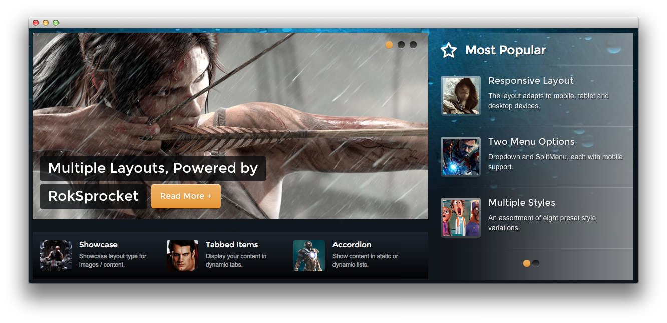
Showcase Section
-
 1RokSprocket2Text3RokSprocket
Here is the widget breakdown for the Showcase section:
- RokSprocket
- Text
- Gantry Divider
- RokSprocket
RokSprocket
The main feature slideshow located near the top of the demo is a RokSprocket widget. You will need to do two things to prepare this widget so that it looks similar to the one in the demo.
First, you will need to create the RokSprocket Widget. You can do this by navigating to Administration -> RokSprocket Admin and creating a new Features widget.
You can find out more about RokSprocket and how to set up and modify widgets by visiting our RokSprocket documentation.
Here is a look at the Features Layout Options for this widget.
| Option | Setting |
|---|---|
| Display Limit | ∞ |
| Theme | Slideshow |
| Article Titles | Show |
| Article Text | Show |
| Preview Length | ∞ |
| Strip HTML Tags | No |
| Arrow Navigation | Show on Hover |
| Pagination | Show |
| Animation | Randomize |
| Autoplay | Disable |
| Autoplay Delay | 5 |
| Image Resize | Disable |
| Default Title | None |
You can set the RokSprocket filters to include any category, specific posts, or otherwise you would like to have featured in this widget.
Once you have created this widget, you can add it via the Widgets menu by clicking RokSprocket and dragging it to the appropriate section. When you have done this, you will need to complete the following.
- Select your RokSprocket Features widget in the Choose Widget field.
- Enter
fp-roksprocket-slideshowin the Custom Variations field. - Leaving everything else at its default setting, select Save.
The widget should now be created and ready for use on the front page of your WordPress site.
Text
This section of the page is a standard text widget. You will need to enter the following in the main text field.
    <div class="gantry-width-33 gantry-width-block">
    <div class="gantry-width-25 gantry-width-block">
      <div class="rt-image"><img src="/image/example.jpg" alt="image"></div>
    </div>
    <div class="gantry-width-75 gantry-width-block">
      <div class="largemarginleft medpaddingright">
        <h5 class="nomargintop smallmarginbottom">
<span class="hidden-tablet">Showcase</span><span class="visible-tablet">Features</span>
</h5>
        <small>Showcase layout type<span class="hidden-tablet"> for images / content</span>.</small>
      </div>
    </div>
</div>
<div class="gantry-width-33 gantry-width-block">
    <div class="gantry-width-25 gantry-width-block">
      <div class="rt-image"><img src="/image/example2.jpg" alt="image"></div>
    </div>
    <div class="gantry-width-75 gantry-width-block">
      <div class="largemarginleft medpaddingright">
        <h5 class="nomargintop smallmarginbottom">
<span class="hidden-tablet">Tabbed Items</span><span class="visible-tablet">Tabs</span>
</h5>
        <small>Display your content in <span class="hidden-tablet">dynamic </span>tabs.</small>
      </div>
    </div>
</div>
<div class="gantry-width-33 gantry-width-block">
    <div class="gantry-width-25 gantry-width-block">
      <div class="rt-image"><img src="/image/example3.jpg" alt="image"></div>
    </div>
    <div class="gantry-width-75 gantry-width-block">
      <div class="largemarginleft medpaddingright">
        <h5 class="nomargintop smallmarginbottom">
<span class="hidden-tablet">Accordion</span><span class="visible-tablet">Lists</span>
</h5>
        <small>Show content in<span class="hidden-tablet"> static or dynamic</span> lists.</small>
      </div>
    </div>
</div>
<div class="clear"></div>
Here is a breakdown of options changes you will want to make to match the demo.
- Set the Box Variation option to Box 2.
- Set the Margin Variation option to No Margin Left
- Enter
fp-showcase-a hidden-phonein the Custom Variations field. - Leaving everything else at its default setting, select Save.
Gantry Divider
This widget tells WordPress to start a new widget column beginning with the widget placed directly below the divider in the section.
RokSprocket
The widget located in this section of the page is a RokSprocket Lists widget created in a very similar way to the previous RokSprocket widgets featured on the front page of the demo.
First, you will need to create the RokSprocket widget. You can do this by navigating to Administration -> RokSprocket Admin and creating a new Lists widget.
You can find out more about RokSprocket and how to set up and modify widgets by visiting our RokSprocket documentation.
Here is a look at the Lists Layout Options for this widget.
| Option | Setting |
|---|---|
| Theme | Default |
| Collapsible Preview | Disable |
| Preview Length | 20 |
| Strip HTML Tags | No |
| Previews Per Page | 3 |
| Arrow Navigation | Show |
| Pagination | Show |
| Autoplay | 5 |
| Image Resize | Disable |
You can set the RokSprocket filters to include any category, specific posts, or otherwise you would like to have featured in this widget.
Once you have created this widget, you can add it via the Widgets menu by clicking RokSprocket and dragging it to the appropriate section. When you have done this, you will need to complete the following.
- Set the Title to
Most Popular - Set the Box Variation option to Box 6.
- Set the Title Variation option to Title 4.
- Enter
icon-star-empty fp-roksprocket-lists-1in the Custom Variations field. - Leaving everything else at its default setting, select Save.
The widget should now be created and ready for use on the front page of your WordPress site.