Lumiere: Recreating the Demo - Showcase
Your Guide to Recreating Elements of the Lumiere Theme for WordPress
Showcase Section
Here is the widget breakdown for the Showcase section:
- RokSprocket
RokSprocket
The main feature showcase located near the top of the demo is a RokSprocket widget. You will need to do two things to prepare this widget so that it looks similar to the one in the demo.
First, you will need to create the RokSprocket Widget. You can do this by navigating to Administration -> RokSprocket Admin and creating a new Features widget.
You can find out more about RokSprocket and how to set up and modify widgets by visiting our RokSprocket documentation.
The video element on the top of Lumiere is enabled via the Gantry Video Background widget present in the Video Background widget position. You can further configure this element by visiting Admin -> Lumiere Theme -> Style and changing settings in the Video area of the menu.
Here is a look at the Features Layout Options for this widget.
| Option | Setting |
|---|---|
| Display Limit | ∞ |
| Theme | Showcase |
| Article Titles | Show |
| Article Text | Show |
| Preview Length | ∞ |
| Strip HTML Tags | No |
| Arrow Navigation | Show |
| Pagination | Hide |
| Animation | Crossfade |
| Autoplay | Disable |
| Autoplay Delay | 5 |
| Image Resize | Disable |
You can set the RokSprocket filters to include any category, specific posts, or otherwise you would like to have featured in this widget.
Filtered post List
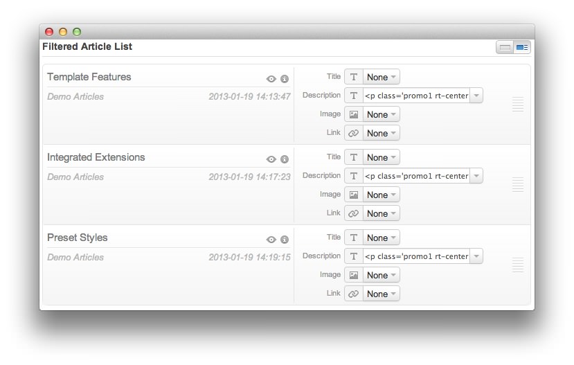
Below is the HTML code for the sample content, to be placed in the description field in each line item on RokSprocket. There are three separate blocks of code below to represent the three different posts presented in our demo. This step does not activate the embedded video feature (this is handled in the theme Manager), but it will enable you to have text display over the video as it does in our demo.
theme Features
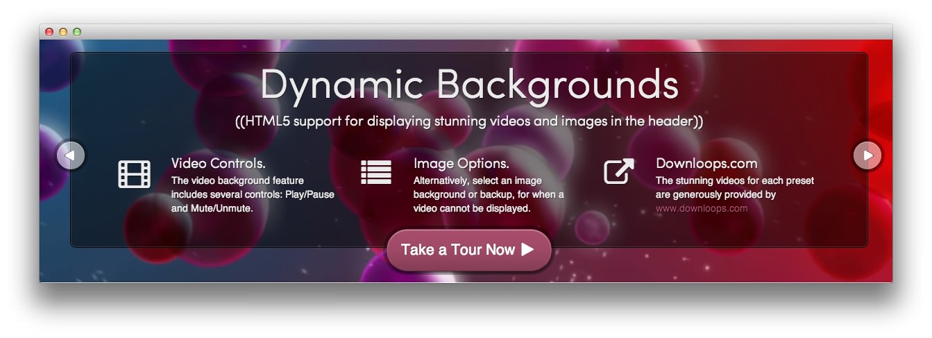
<p class='promo1 rt-center nomarginbottom'>Dynamic Backgrounds</p>
<p class='promo3 rt-center'>((HTML5 support for displaying stunning videos and images in the header))</p>
<div class='gantry-width-block demo-width-100 smallmarginbottom'>
<div class='gantry-width-33 gantry-width-block'>
<div class='gantry-width-spacer'>
<div class='gantry-width-25 gantry-width-block'>
<span class='big-icon icon-film'></span>
</div>
<div class='gantry-width-75 gantry-width-block'>
<p class='promo3 nomarginbottom'><span class='hidden-tablet'>Video </span> Controls.</p>
<p class='rt-fadeout'>The video background feature includes several controls: Play/Pause and Mute/Unmute.</p>
</div>
</div>
</div>
<div class='gantry-width-33 gantry-width-block'>
<div class='gantry-width-spacer'>
<div class='gantry-width-25 gantry-width-block'>
<span class='big-icon icon-list'></span>
</div>
<div class='gantry-width-75 gantry-width-block'>
<p class='promo3 nomarginbottom'>Image<span class='hidden-tablet'> Option</span>s.</p>
<p class='rt-fadeout'>
<span class='visible-large rt-floatleft nomarginright'>Alternatively, s</span>
<span class='hidden-large rt-floatleft nomarginright'>S</span>elect an image background or backup, for when a video cannot be displayed.
</p>
</div>
</div>
</div>
<div class='gantry-width-33 gantry-width-block'>
<div class='gantry-width-spacer'>
<div class='gantry-width-25 gantry-width-block'>
<span class='big-icon icon-external-link'></span>
</div>
<div class='gantry-width-75 gantry-width-block'>
<p class='promo3 nomarginbottom'>Downloops.com</p>
<p class='rt-fadeout'>The stunning videos for each preset are generously provided by <a href='http://www.downloops.com/'>www.downloops.com</a></p>
</div>
</div>
</div>
</div>
<p class='rt-center'>
<a href='index.php?option=com_content&view=post&id=10&Itemid=117' class='big-button readon'>Take a Tour Now <span class='icon-play'></span></a>
</p>
Integrated Extensions
<p class='promo1 rt-center nomarginbottom'>RokSprocket<span class='hidden-tablet'> Styling</span></p>
<p class='promo3 rt-center'>((RokSprocket is a powerful content display extension<span class='hidden-tablet'>, that is quick and easy to use</span>))</p>
<div class='gantry-width-block demo-width-100 smallmarginbottom'>
<div class='gantry-width-33 gantry-width-block'>
<div class='gantry-width-spacer'>
<div class='gantry-width-25 gantry-width-block'>
<span class='big-icon icon-edit'></span>
</div>
<div class='gantry-width-75 gantry-width-block'>
<p class='promo3 nomarginbottom'>Intuitive<span class='hidden-tablet'> UI</span>.</p>
<p class='rt-fadeout'>An advanced interface, used for all layout types, to easily configure RokSprocket.</p>
</div>
</div>
</div>
<div class='gantry-width-33 gantry-width-block'>
<div class='gantry-width-spacer'>
<div class='gantry-width-25 gantry-width-block'>
<span class='big-icon icon-list-ul'></span>
</div>
<div class='gantry-width-75 gantry-width-block'>
<p class='promo3 nomarginbottom'>Headlines<span class='hidden-tablet'> Layout</span>.</p>
<p class='rt-fadeout'>A snippet layout type, ideal for previewing content items, such as for newsflash posts.</p>
</div>
</div>
</div>
<div class='gantry-width-33 gantry-width-block'>
<div class='gantry-width-spacer'>
<div class='gantry-width-25 gantry-width-block'>
<span class='big-icon icon-th'></span>
</div>
<div class='gantry-width-75 gantry-width-block'>
<p class='promo3 nomarginbottom'>Mosaic<span class='hidden-tablet'> Layout</span>.</p>
<p class='rt-fadeout'>A grid type layout mode to easily display multiple content blocks, in a magazine format.</p>
</div>
</div>
</div>
</div>
<p class='rt-center'>
<a href='index.php?option=com_content&view=post&id=6&Itemid=113' class='big-button readon'>Take a Tour Now <span class='icon-play'></span></a>
</p>
Preset Styles
<p class='promo1 rt-center nomarginbottom'><span class='hidden-tablet'>Advanced </span>Menus</p>
<p class='promo3 rt-center'>((Choose between two available menu options<span class='hidden-tablet'>, Dropdown Menu or SplitMenu, or none</span>))</p>
<div class='gantry-width-block demo-width-100 smallmarginbottom'>
<div class='gantry-width-33 gantry-width-block'>
<div class='gantry-width-spacer'>
<div class='gantry-width-25 gantry-width-block'>
<span class='big-icon icon-edit'></span>
</div>
<div class='gantry-width-75 gantry-width-block'>
<p class='promo3 nomarginbottom'>Dropdown<span class='hidden-tablet'> Menu</span>.</p>
<p class='rt-fadeout'>A CSS based dropdown menu, with support for multiple columns with custom widths.</p>
</div>
</div>
</div>
<div class='gantry-width-33 gantry-width-block'>
<div class='gantry-width-spacer'>
<div class='gantry-width-25 gantry-width-block'>
<span class='big-icon icon-list-ul'></span>
</div>
<div class='gantry-width-75 gantry-width-block'>
<p class='promo3 nomarginbottom'><span class='hidden-tablet'>More </span>Features.</p>
<p class='rt-fadeout'>The Dropdown Menu also has support for inline text, icons, modules and positions.</p>
</div>
</div>
</div>
<div class='gantry-width-33 gantry-width-block'>
<div class='gantry-width-spacer'>
<div class='gantry-width-25 gantry-width-block'>
<span class='big-icon icon-th'></span>
</div>
<div class='gantry-width-75 gantry-width-block'>
<p class='promo3 nomarginbottom'>SplitMenu.</p>
<p class='rt-fadeout'>A versatile, static horizontal menu system that displays its children in the sidebar.</p>
</div>
</div>
</div>
</div>
<p class='rt-center'>
<a href='index.php?option=com_content&view=post&id=5&Itemid=112' class='big-button readon'>Take a Tour Now <span class='icon-play'></span></a>
</p>
Once you have created this widget, you can add it via the Widgets menu by clicking RokSprocket and dragging it to the appropriate section. When you have done this, you will need to complete the following.
- Select your RokSprocket Features widget in the Choose Widget field.
- Set the Corner Variation option to Basic.
- Enter
fp-demo-showcasein the Custom Variations field. - Leaving everything else at its default setting, select Save.
The widget should now be created and ready for use on the front page of your WordPress site.