RokSprocket: Features Layout Mode
Your Guide to the Features RokSprocket Layout Mode for WordPress
Features
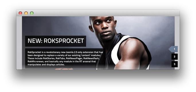
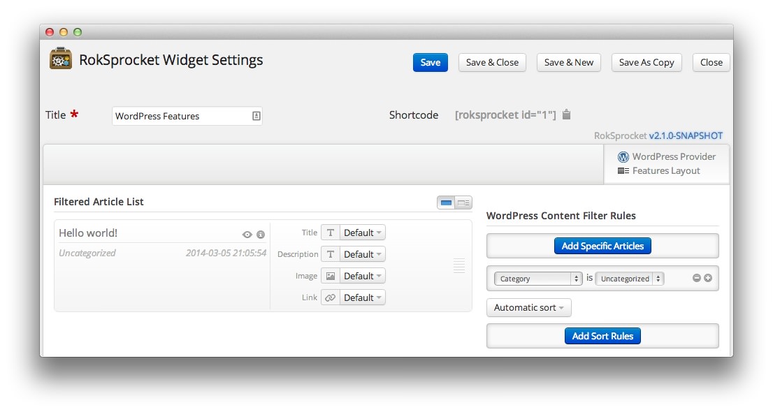
Features is a content slideshow/showcase layout mode. It can display both images and text, or images only, with varying options on their display. Here is a look at the options screen for the Features layout mode.
Themes
The Features layout mode has three built-in themes. These include: Slideshow, Slideshow2, and Showcase.
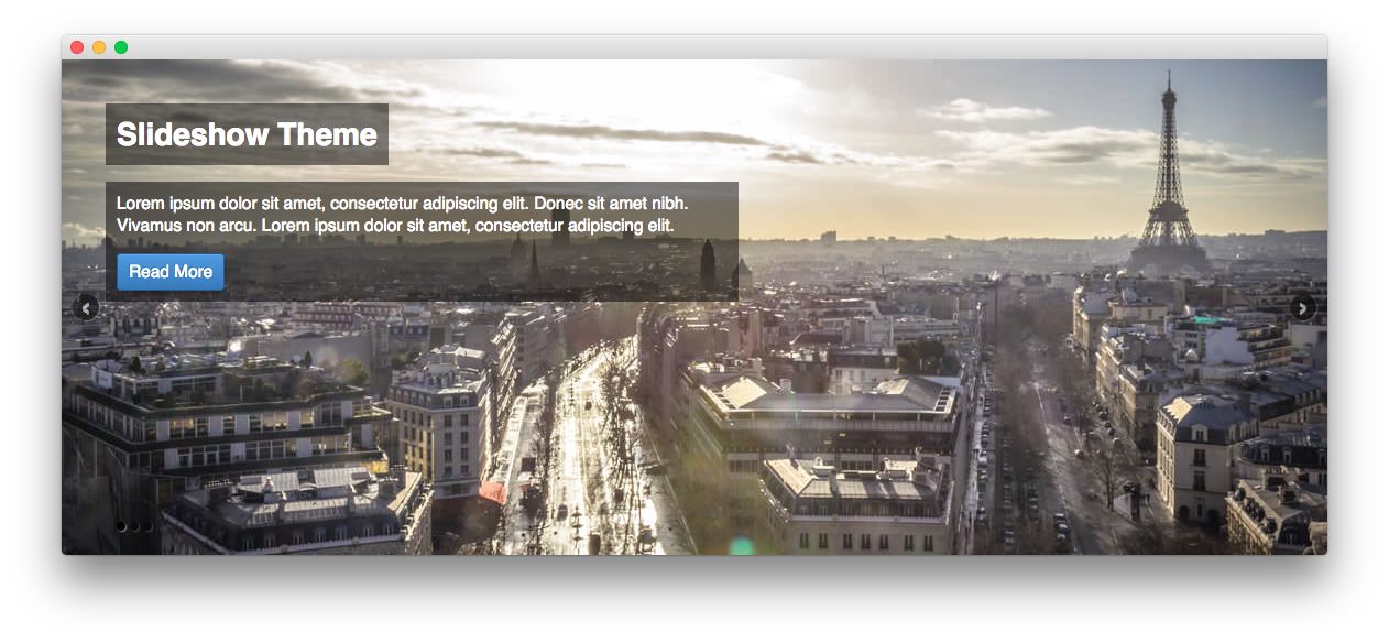
The Slideshow theme is all about your images. This theme makes your image the background of the widget, overlaying the item's title and description in an elegant, modern way.
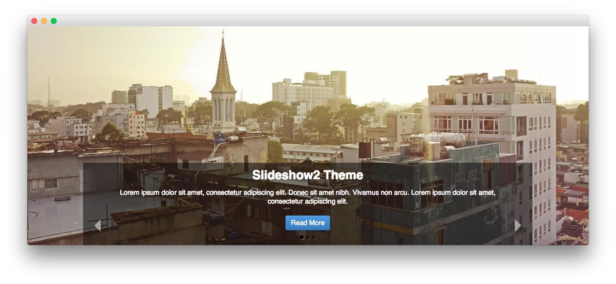
The Slideshow2 theme also gives your images center stage. It presents content in a way that doesn't distract from the image.
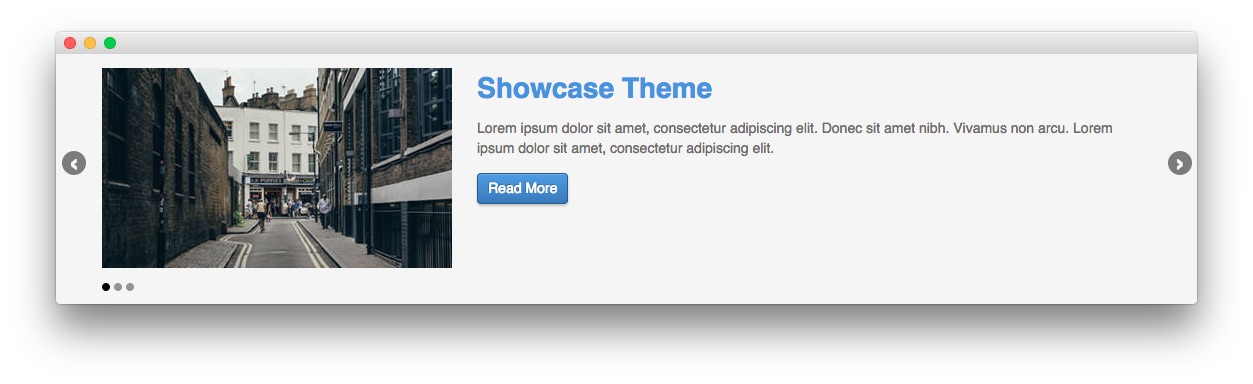
The Showcase theme is a modern, easy to read and follow approach that gives you the ability to have a great looking widget, with or without an accompanying image.
Setup
-
 1TitleThis is the title you wish to give the RokSprocket instance. This is only used as a label on the backend, as the widget title will be what appears on the frontend of the site.2Filtered Article List OptionsGives you access to item-specific settings for the posts title, description, image, and link.3Content Filter RulesSets the content filter rules for the widget.
The Title is the label you wish to give the RokSprocket instance. This is only used as a label on the backend, as the widget title will be what appears on the frontend of the site.
-
The Filtered Article List gives you access to item-specific settings including:
- Title - Allows you to override the post title in the widget. The post title will be used if this is left at Default.
- Description - Allows you to set a description for the feature. If this is left at Default the introtext from the post is used.
- Image - This allows you to circumvent the assigned image from the post and replace it with one specifically for the feature.
- Link - If set, the link will show a *Read More** button as well as link the title. On specific themes, it will link the image in the feature, as well.
The Content Filter Rules section gives you the ability to determine how the widget will pull content to make up the features. For example, you can have the widget pull posts that are within a specific category, contain a particular name or keyword in the title, or choose specific posts. You can also modify how this content is sorted in the widget.
Below the Content Filter Rules section are two options areas specific to the layout mode you have chosen. We have broken down the Features Layout Options and Features Article Defaults sections below.
-
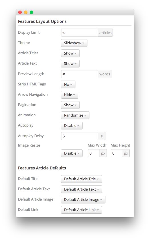 1Display LimitThe amount of posts to show when rendering.2ThemeThis sets the theme for displaying features in the widget.3Article TitlesThis toggle enables you to show or hide post titles.4Article TextThis toggle allows you to show or hide post text in a features.5Preview LengthThis option sets the amount of words you wish to limit the preview to within the widget's post display.6Strip HTML TagsThis option removes HTML tags from the description of a post.7Arrow NavigationThis option determines whether you wish to show or hide the arrow navigation controls on the widget.8PaginationThis toggle gives you control over whether or not you wish to show pagination.9AnimationThis dropdown gives you the ability to set the type of animation that happens during transitions from one feature to the next.10AutoplaySets whether you want the widget to start rolling through features automatically when the page loads, or to await a command from the visitor.11Autoplay DelaySets the amount of time between cycled features in the widget. The longer this delay (in seconds), the longer a single post will be featured in the widget.12Image ResizeThis option is best utilized on a non-responsive theme. It renders a copy of the selected image with a maximum width or height determined in these fields.13Default TitleYou can set a default title for all posts from this field. If this selection is set at
Default post Title, then the post's given titles are used.14Default Article TextThis field allows you to set default post text for all features in the widget. If this is not changed from its default, then the post's introductory text is used.15Default Article ImageDetermines which image field the widget will default to when locating an image for the feature.16Default LinkDetermines which link field the widget will default to when locating a link for the feature.
The Display Limit field sets the amount of posts shown when the page is rendered. Setting this limit to zero or infinity will allow it to cycle through all applicable items.
The Theme option sets the theme for displaying features in the widget. These themes determine how the features look within the widget. You can choose the one that best fits your theme and/or personal taste.
The post Titles toggle enables you to show or hide post titles. When a photo and/or the description says it all, you can opt to hide the title from the widget feature display.
The post Text toggle allows you to show or hide post text in a features. This is handy when you want to only display titles and photos in the widget.
The Preview Length option sets the amount of words you wish to limit the preview to within the widget's post display. This can help reduce occurrences of controls overlaying the description and make your features more uniform.
The Strip HTML Tags option removes HTML tags from the description of a post.
The Arrow Navigation option determines whether you wish to show or hide the arrow navigation controls on the widget.
The Pagination toggle gives you control over whether or not you wish to show pagination.
The Animation dropdown gives you the ability to set the type of animation that happens during transitions from one feature to the next.
Autoplay sets whether you want the widget to start rolling through features automatically when the page loads, or to await a command from the visitor.
Autoplay Delay sets the amount of time between cycled features in the widget. The longer this delay (in seconds), the longer a single post will be featured in the widget.
The Image Resize option is best utilized on a non-responsive theme. It renders a copy of the selected image with a maximum width or height determined in these fields. This option is disabled by default, but can be used to fit a variety of themes which would benefit from this uniformity. In a responsive theme, images will continue to expand or shrink based on the grid and browser window size.
You can set a default title for all posts from the Default Title field. If this selection is set at Default Article Title, then the post's given titles are used. Alternatively, you can choose to use Post Content or a Post Excerpt in place of the title.
The Default Article Text field allows you to set default post text for all features in the widget. If this is not changed from its default, then the post's introductory text is used. You can choose to use post content, an assigned post excerpt, the default article text, or to have nothing appear at all.
The Default Article Image option gives you the ability to set a standard default image for posts. This includes either the default article image or a custom image.
The Default Article Link gives you the ability to set a default link field from posts in the widget. This can be either the default article link, a custom link that applies as the default for all items, or nothing at all.