RokMicroNews
Your Guide to Using RokMicroNews for WordPress
Widget Setup
RokMicroNews has a wide variety of different widget settings that enable you to customize the widget to meet your individual needs. You can do everything from enabling custom CSS to defining the layout of the widget itself.
For the interest of this guide, we have broken the widget controls into two sections. These will appear as a single vertical menu within the widget's settings area.
You can place RokMicroNews into any widget area in your site by navigating to Admin -> Appearance -> Widgets and clicking and dragging RokMicroNews Widget to your desired widget area.
-
 1TitleThis field adds the widget title. If the field is left blank, no title will appear.2Use Custom CSSIf you select yes, the widget will not load its own CSS. You can create your own for use with RokMicroNews.3Content CategoryChoose the category of posts to display.4OrderingSelect the sorting order for displayed posts.5Content TypeYou can choose to display the post's content, or data in the excerpt field.6Number of PostsThis field determines the number of posts to display from the category.7Preview LengthThis sets the character length of the preview prior to the "Read More" link.8Navigation InteractionYou can choose to have the widget navigable by mouseover or click.9First Load StatusThis setting determines if RokMicroNews is expanded or collapsed when the page first loads.10Navigation PositionYou can choose between a right or left position for the navigation area of the widget.11Show Post titleThis setting allows you to hide or display the title of displayed posts.12Show "Read More"You can opt to have the "Read More" button appear or remain hidden.13"Read More" LabelThis field determines the text that will appear as the "Read More" label.14Show ControlsYou can choose to have visitor controls appear, allowing users to expand or collapse the widget, as well as rearrange RokMicroNews widgets to meet user preferences.15Show ThumbnailThis option allows you to hide the thumbnail image for associated posts.16Catch First ImageIf no thumbnail is set, you can choose this option to have the widget display a thumbnail-size copy of the first image that appears in the post.17Thumbnail GeneratorYou can use this option to switch between any installed thumbnail generators. Your site may have only one installed, though others can be added.18Thumbnail SizeThis option determines the size of the associated thumbnail.
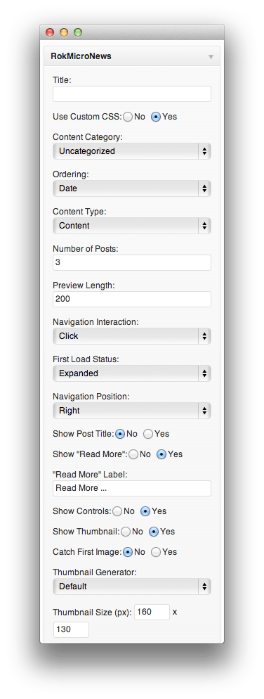
Title: This field adds the widget title. If the field is left blank, no title will appear.
Use Custom CSS: If you select yes, the widget will not load its own CSS. You can create your own for use with RokMicroNews.
Content Category: Choose the category of posts to display.
Ordering: Select the sorting order for displayed posts.
Content Type: You can choose to display the post's content, or data in the excerpt field.
Number of Posts: This field determines the number of posts to display from the category.
Preview Length: This sets the character length of the preview prior to the "Read More" link.
Navigation Interaction: You can choose to have the widget navigable by mouseover or click.
First Load Status: This setting determines if RokMicroNews is expanded or collapsed when the page first loads.
Navigation Position: You can choose between a right or left position for the navigation area of the widget.
Show Post Title: This setting allows you to hide or display the title of displayed posts.
Show "Read More": You can opt to have the "Read More" button appear or remain hidden.
"Read More" Label: This field determines the text that will appear as the "Read More" label.
Show Controls: You can choose to have visitor controls appear, allowing users to expand or collapse the widget, as well as rearrange RokMicroNews widgets to meet user preferences.
Show Thumbnail: This option allows you to hide the thumbnail image for associated posts.
Catch First Image: If no thumbnail is set, you can choose this option to have the widget display a thumbnail-size copy of the first image that appears in the post.
Thumbnail Generator: You can use this option to switch between any installed thumbnail generators. Your site may have only one installed, though others can be added.
Thumbnail Size This option determines the size of the associated thumbnail.
-
 1Allowed HTML TagsThis field determines which HTML tags are allowed in the content preview area.2Extra Widget CSS ClassYou can use this field to add custom CSS Class values to the widget.3GD2 Library PresentThis is a check for the presence of a GD2 Library.4Cache Dir WritableThis check discovers whether or not your cache directory is writable.
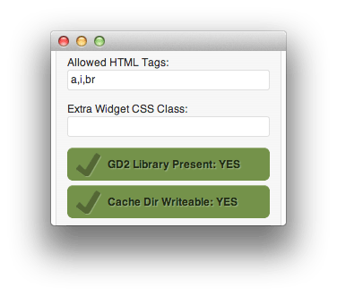
Allowed HTML Tags: This field determines which HTML tags are allowed in the content preview area.
Extra Widget CSS Class: You can use this field to add custom CSS Class values to the widget.
GD2 Library Present: This is a check for the presence of a GD2 Library.
Cache Dir Writable: This check discovers whether or not your cache directory is writable.
A Gantry theme may offer additional customization options based on the theme.