RokGallery: Widget Guide
Your Guide to Setting Up and Using RokGallery Widgets for WordPress
Creating a Widget
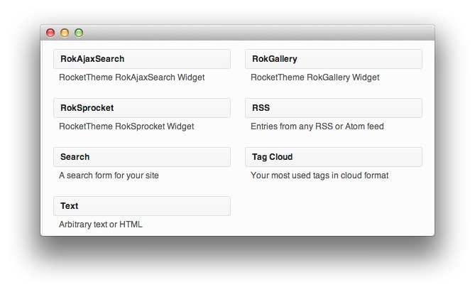
Creating a RokGallery widget is a fairly straightforward process. You Would create it as you would any other widget by navigating to Admin -> Appearance -> Widgets and selecting RokGallery from Available Widgets and dragging them to the desired widget position on the right side of the page.
Widget Configuration
For the purpose of this documentation, we will split the widget settings into multiple images, each with an explanation of the various options and what they mean. Within the Widget field of WordPress, this appears as a single, continuous block.
-
 1Show TitleThis is where you can insert title of your widget. If anything is written in this field, it will appear as a title for the widget. If left blank, no title will appear.2GalleryThis option allows you to assign a RokGallery tag gallery to the widget. Simply hit Select and choose the gallery you wish to assign to the widget. You can also assign gallery slice settings to the widget through this option.3Link TypeThis option sets the action resulting from clicking the image in the gallery. You can set it to work with RokBox or one determined by the slice settings of the image, the full image, or do nothing at all.4Default Linked ItemIf you have selected Link in Slice and you have not set a link within the slice, this will be the link the gallery defaults to.5Show TitleThis option sets whether or not the title of a slice is shown in the gallery.6Show CaptionThis option sets whether or not the caption of a slice appears in the gallery.7Sort ByThis option sets the default sorting order for images in the gallery.8Sort DirectionYou can choose to have items sorted in ascending or descending order based on the Sort By setting.9Slice LimitYou can set the limit of slices which appear in the gallery.10Gallery StyleThis option allows you to choose from a light or dark gallery style, affecting the look of the gallery within the widget.
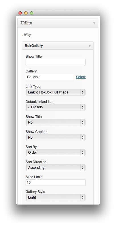
Show Title: This is where you can insert title of your widget. If anything is written in this field, it will appear as a title for the widget. If left blank, no title will appear.
Gallery: This option allows you to assign a RokGallery tag gallery to the widget. Simply hit Select and choose the gallery you wish to assign to the widget. You can also assign gallery slice settings to the widget through this option.
Link Type: This option sets the action resulting from clicking the image in the gallery. You can set it to work with RokBox or one determined by the slice settings of the image, the full image, or do nothing at all.
Default Linked Item: If you have selected Link in Slice and you have not set a link within the slice, this will be the link the gallery defaults to.
Show Title: This option sets whether or not the title of a slice is shown in the gallery.
Show Caption: This option sets whether or not the caption of a slice appears in the gallery.
Sort By: This option sets the default sorting order for images in the gallery.
Sort Direction: You can choose to have items sorted in ascending or descending order based on the Sort By setting.
Slice Limit You can set the limit of slices which appear in the gallery.
Gallery Style: This option allows you to choose from a light or dark gallery style, affecting the look of the gallery within the widget.
Grid
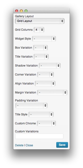
The Grid layout allows you the option to choose how many columns appear in your grid, and to select a background image (if your theme allows).
-
 1Gallery LayoutThe gallery can be laid out in a Grid, Slideshow, or Showcase pattern.2Grid ColumnsThis option sets the number of columns used to display slices in the Grid layout.3Widget Style(Supported Gantry Themes Only) Sets the widget style for the gallery. You can choose from Flush, Flush Bottom, or Flush Top.4Box Variation(Supported Gantry Themes Only) Sets a background look for the widget box, based on the active theme.5Title Variation(Supported Gantry Themes Only) Allows you to choose from different title variations, based on the theme.6Shadow Variation(Supported Gantry Themes Only) Allows you to choose from different shadow appearances, based on the theme.7Corner Variation(Supported Gantry Themes Only) Allows you to choose from different corner appearances, based on the theme.8Align Variation(Supported Gantry Themes Only) Allows you to choose from different alignment variations, based on the theme.9Margin Variation(Supported Gantry Themes Only) Allows you to choose from different margin variations, based on the theme.10Padding Variation(Supported Gantry Themes Only) Allows you to choose from different padding options.11Title Style(Supported Gantry Themes Only) Allows for standardcase, uppercase, and lowercase titling.12Custom Chrome(Supported Gantry Themes Only) Allows you to decide between basic, menu, and standard custom chrome options. This is theme-specific.13Custom Variations(Supported Gantry Themes Only) This field allows you to add custom variations, determined in the theme's primary LESS file.
Gallery Layout: The gallery can be laid out in a Grid, Slideshow, or Showcase pattern. This option more than any other impacts the way the gallery will appear within the widget block on the site. The options appearing below this are dynamically generated based on the gallery layout selected.
-
Grid Columns: This option sets the number of columns used to display slices in the Grid layout.
Options 3-13 are specific to themes powered by the Gantry framework and will only appear when a Gantry theme is active.
Widget Style: Sets the widget style for the gallery. You can choose from Flush, Flush Bottom, or Flush Top.
Box Variation: Sets a background look for the widget box, based on the active theme.
Title Variation: Allows you to choose from different title variations, based on the theme.
Shadow Variation: Allows you to choose from different shadow appearances, based on the theme.
Corner Variation: Allows you to choose from different corner appearances, based on the theme.
Align Variation: Allows you to choose from different alignment variations, based on the theme.
Margin Variation: Allows you to choose from different margin variations, based on the theme.
Padding Variation: Allows you to choose from different padding options.
Title Style: Allows for standardcase, uppercase, and lowercase titling.
Custom Chrome: Allows you to decide between basic, menu, and standard custom chrome options. This is theme-specific.
Custom Variations: This field allows you to add custom variations, determined in the theme's primary LESS file.
Slideshow Layout
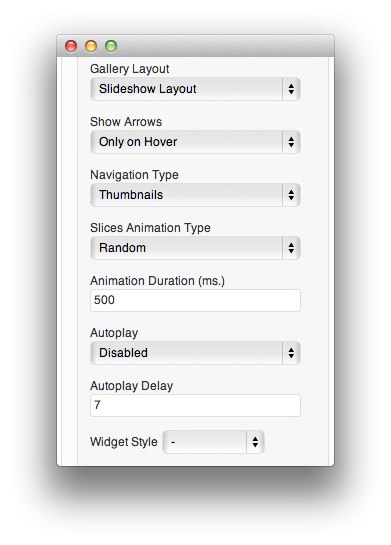
The Slideshow layout allows you to determine if you wish to show arrows on either side of the image as well as set your navigation and animation types. You can also tell it whether or not you wish slideshows to autoplay, and with what delay between images.
-
 1Gallery LayoutThe gallery can be laid out in a Grid, Slideshow, or Showcase pattern.2Show ArrowsThis option determines if and/or when navigation arrows appear over the displayed image.3Navigation TypeIf multiple navigation types are available, they will appear as an option in this list.4*Slices Animation Type** This option determines what animation style (or styles) will be used to animate slices in the gallery.5Animation DurationThis field determines (in milliseconds) the duration of the animation from one slice to another.6AutoplayDetermines whether the transition between slices occurs automatically upon page load or at the selection of the visitor.7Autoplay DelayYou can set the amount of time between transitions when Autoplay is enabled.8Widget Style(Supported Gantry Themes Only) Sets the widget style for the gallery. You can choose from Flush, Flush Bottom, or Flush Top.
Gallery Layout: The gallery can be laid out in a Grid, Slideshow, or Showcase pattern. This option more than any other impacts the way the gallery will appear within the widget block on the site. The options appearing below this are dynamically generated based on the gallery layout selected.
Show Arrows: This option determines if and/or when navigation arrows appear over the displayed image.
Navigation Type: If multiple navigation types are available, they will appear as an option in this list.
Slices Animation Type: This option determines what animation style (or styles) will be used to animate slices in the gallery.
Animation Duration: This field determines (in milliseconds) the duration of the animation from one slice to another.
Autoplay: Determines whether the transition between slices occurs automatically upon page load or at the selection of the visitor.
Autoplay Delay: You can set the amount of time between transitions when Autoplay is enabled.
Widget Style: (Supported Gantry Themes Only) Sets the widget style for the gallery. You can choose from Flush, Flush Bottom, or Flush Top.
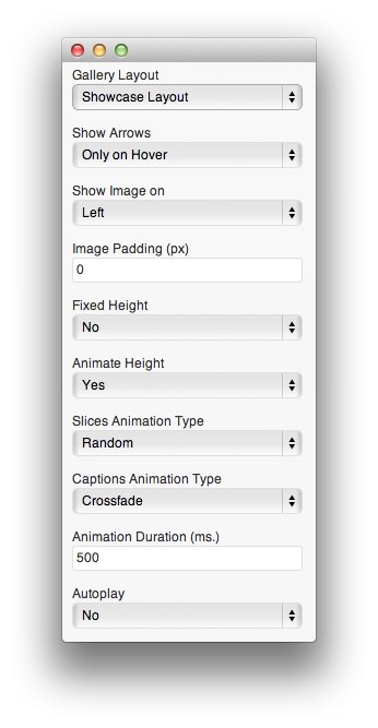
Showcase
The Showcase layout works very similarly. You have the option to choose whether or not you wish to have arrows appear as a secondary navigation option, which direction the image will appear in the showcase in relation to the thumbnails, image padding, and animation options. These options remain the same for both fixed and responsive versions of the Showcase layout.
-
 1Gallery LayoutThe gallery can be laid out in a Grid, Slideshow, or Showcase pattern.2Show ArrowsThis option determines if and/or when navigation arrows appear over the displayed image.3Show Image onThis setting determines where within the Showcase the image will appear.4Image PaddingThis option allows you to set the padding for the image (measured in pixels).5Fixed HeightDetermines whether the slices will appear at a fixed or variable height.6Animate HeightThis setting allows the user to choose between an animated or non-animated transition between slices of varying heights.7Slices Animation TypeSets the animation type that occurs between slices.8Captions Animation TypeSets the animation type that occurs during the transition of image captions.9Animation DurationThis field determines (in milliseconds) the duration of the animation from one slice to another.10Autoplay and Autoplay DelayDetermines whether the transition between slices occurs automatically upon page load or at the selection of the visitor. You can also set the amount of time between transitions when Autoplay is enabled.
Gallery Layout: The gallery can be laid out in a Grid, Slideshow, or Showcase pattern. This option more than any other impacts the way the gallery will appear within the widget block on the site. The options appearing below this are dynamically generated based on the gallery layout selected.
Show Arrows: This option determines if and/or when navigation arrows appear over the displayed image.
Show Image on: This setting determines where within the Showcase the image will appear.
Image Padding: This option allows you to set the padding for the image (measured in pixels).
Fixed Height: Determines whether the slices will appear at a fixed or variable height.
Animate Height: This setting allows the user to choose between an animated or non-animated transition between slices of varying heights.
Slices Animation Type: Sets the animation type that occurs between slices.
Captions Animation Type: Sets the animation type that occurs during the transition of image captions.
Animation Duration: This field determines (in milliseconds) the duration of the animation from one slice to another.
Autoplay and Autoplay Delay: Determines whether the transition between slices occurs automatically upon page load or at the selection of the visitor. You can also set the amount of time between transitions when Autoplay is enabled.