Nuance: Recreating the Demo - RokSprocket Grids - Multiple Layouts
Your Guide to Recreating Elements of the Nuance Demo for Joomla
RokSprocket Grids - Multiple Layouts
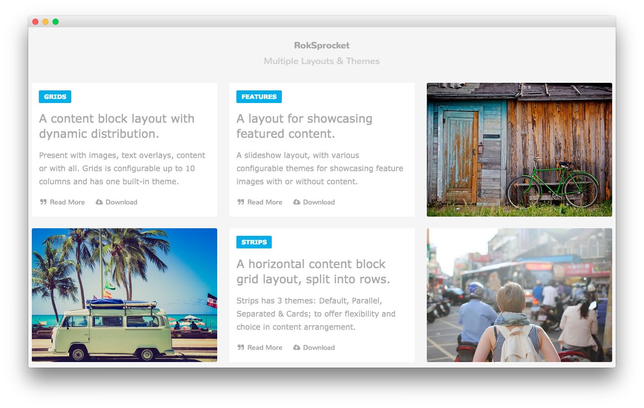
This area of the page is a RokSprocket module utilizing the Simple content provider and the Grids layout.
The settings used in our demo are listed below.
Details

| Option | Setting |
|---|---|
| Title | RokSprocket[span class="rt-title-tag"]Multiple Layouts & Themes[/span] |
| Show Title | Show |
| Access | Public |
| Position | maintop-a |
| Status | Published |
| Content Provider | Simple |
| Layout Mode | Grids |
The title of this module requires RokCandy in order to appear properly on the screen due to the
[span]tags present. See the main RokCandy guide for additional instructions.
Simple Content Provider
The Title and Description fields in each item have been altered. A few examples of these article changes can be found below, excluding the Image and Link fields which will likely not work on your local copy as the links will be different.
Article 1
Title
Grids
Description
<span class="rt-grids-heading1"><a href="#">A content block layout <span class="hidden-tablet">with dynamic distribution</span>.</a></span><span class="rt-grids-heading2">Present with images, text overlays, content or with all. <span class="visible-large">Grids is configurable up to 10 columns and has one built-in theme.</span></span><span class="rt-grids-heading3"><a class="largemarginright" href="#"><i class="fa fa-quote-right fa-fw"></i> Read More</a> <a href="#"><i class="fa fa-cloud-download fa-fw"></i> Download</a></span>
Article 2
Title
Features
Description
<span class="rt-grids-heading1"><a href="#"><span class="hidden-tablet">A layout for showcasing f</span><span class="visible-tablet">F</span>eatured content.</a></span><span class="rt-grids-heading2"><span>A slideshow layout, with various configurable themes<span class="visible-large"> for showcasing feature images with or without content</span>.</span></span><span class="rt-grids-heading3"><a href="#" class="largemarginright"><i class="fa fa-quote-right fa-fw"></i> Read More</a> <a href="#"><i class="fa fa-cloud-download fa-fw"></i> Download</a></span>
Article 3
The third item has a custom image in the Image field. This enables the grid item to show up as an image with the Description appearing as you move your mouse cursor over it.
Title
Headlines
Description
<span class="rt-grids-heading1"><a href="#">A content snippet or newsticker layout.</a></span><span class="rt-grids-heading2"><span class="hidden-tablet">Headlines is outfitted with a word counter to auto snippet text.</span></span><span class="rt-grids-heading3"><a href="#" class="largemarginright"><i class="fa fa-quote-right fa-fw"></i> Read More</a> <a href="#"><i class="fa fa-cloud-download fa-fw"></i> Download</a></span>
Layout Options
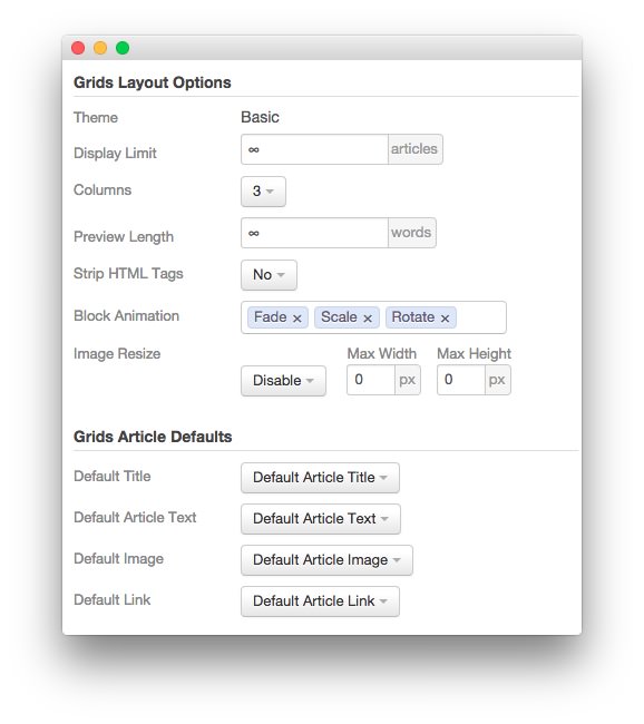
| Option | Setting |
|---|---|
| Theme | Basic |
| Display Limit | ∞ |
| Columns | 3 |
| Preview Length | ∞ |
| Strip HTML Tags | No |
| Block Animation | Fade, Scale, Rotate |
| Image Resize | Disable |
| Default Title | Default Article Title |
| Default Article Text | Default Article Text |
| Default Article Image | Default Article Image |
| Default Link | Default Article Link |
Advanced
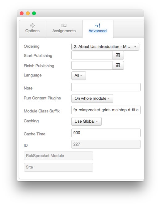
| Option | Setting |
|---|---|
| Module Class Suffix | fp-roksprocket-grids-maintop rt-title-center rt-large-title |