Understanding Responsive Support Classes
Your guide to using responsive support classes in RocketTheme templates.
Another useful feature available, via Bootstrap, is the collection of responsive utility classes that can be used to help tweak layouts by providing a simple method of showing or hiding modules. Insert the following module class suffixes into your module settings to show/hide a module for a particular mode.
| Class | Phones (<= 767px) | Tablets (768-959px) | Desktops (960-1199px) | Desktops (>= 1200px) |
|---|---|---|---|---|
visible-phone |
Visible | Hidden | Hidden | Hidden |
visible-tablet |
Hidden | Visible | Hidden | Hidden |
visible-desktop |
Hidden | Hidden | Visible | Visible |
visible-large |
Hidden | Hidden | Hidden | Visible |
hidden-phone |
Hidden | Visible | Visible | Visible |
hidden-tablet |
Visible | Hidden | Visible | Visible |
hidden-desktop |
Visible | Visible | Hidden | Hidden |
hidden-large |
Visible | Visible | Visible | Hidden |
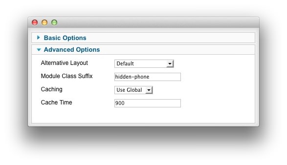
As an example, if you wish to have a login module appear on desktop and tablet devices, but not necessarily phones, you can place hidden-phone in the Module Class Suffix field (as pictured below). This will allow the module to remain visible on any device displaying the page at a width above 768, allowing you to maintain the look you wish to achieve across multiple device types.
This feature enables you to make the most of your site without sacrificing its clean appearance due to limitations in screen size.