Cerulean
Your Guide to Using the Cerulean Template for Joomla
Introduction
Cerulean, the December 2012 template release, is a beautifully constructed template with a three-dimensional style design to add depth to content. An array of module variations add focal points for the mainbody area.
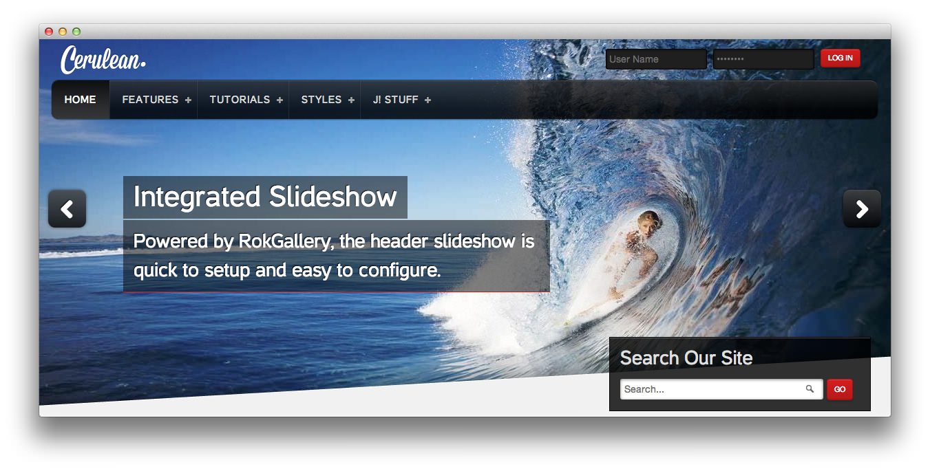
The styling extends to RokSprocket in all its layout modes, such as Mosaic. Based on the Gantry Framework, a wide portfolio of features are included such as a powerful template control interface.
NOTICE: Cerulean is a Joomla 3.x Template.
Requirements
- Apache 2.2+ or Microsoft IIS 7
- PHP 5.3.10+ (PHP 5.5+ Recommended)
- MySQL 5.1+
- Joomla 3.4
NOTE: Gantry v4.1.35 is required for Cerulean to work correctly. For more details on the Gantry Framework, please visit its dedicated website.
Key Features
- Joomla 3.x Compatible
- Responsive Layout
- 6 Preset Styles
- 78 Module Positions
- 9 Styled and 25 Structural Module Suffixes
- RokSprocket Responsive Layout Integrated
- RokGallery Responsive Layout
- Styled Support for Responsive K2 Layout
- Powerful Gantry 4 Framework
- Custom Content Typography
- DropDown Menu & Splitmenu
- FF, Safari, Chrome, Opera, IE8+ Compatible
- HTML5, CSS3, LESS CSS
Responsive Layout
 Cerulean's responsive grid system is designed for desktop, tablet and smartphone systems, each with minor modifications to ensure compatibility in each mode.
The table below shows the breakdown of screen resolutions and associated devices, and which layout characters are then applied to each.
| Label | Description | Layout Width | Column Width |
|---|---|---|---|
| Smartphones | Standard smartphones | 480px and below | 100% fluid |
| Smartphones to Tablets | Larger smartphones and small tablets | 767px and below | 100% fluid |
| Tablets | Larger tablets | 768px and above | 64px |
| Desktop | Standard desktops and laptops | 960px and above | 80px |
| Large Display | Large desktops and high-resolution laptops | 1200px and above | 100px |
Advanced Dropdown Menu
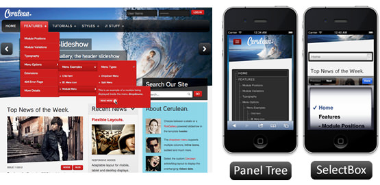 For mobile devices, a basic version of the Dropdown Menu will be used. It is activated by a custom menu icon in the top left of the screen. It will either be a tree view or select box menu, as configurable. All other sizes will use the menu's full version.
Responsive Layout for RokGallery & RokSprocket
 Cerulean comes with the RokGallery and RokSprocket extensions which are built to work with a responsive layout.
K2 (Third Party) Responsive Layout
 K2 is the popular powerful content extension for Joomla! with CCK-like features. Cerulean also comes with the styling support for K2 extension (version 2.6.2) that is built to work with the responsive layout.