Acacia
Your Guide to Using the Acacia Template for Joomla
Introduction
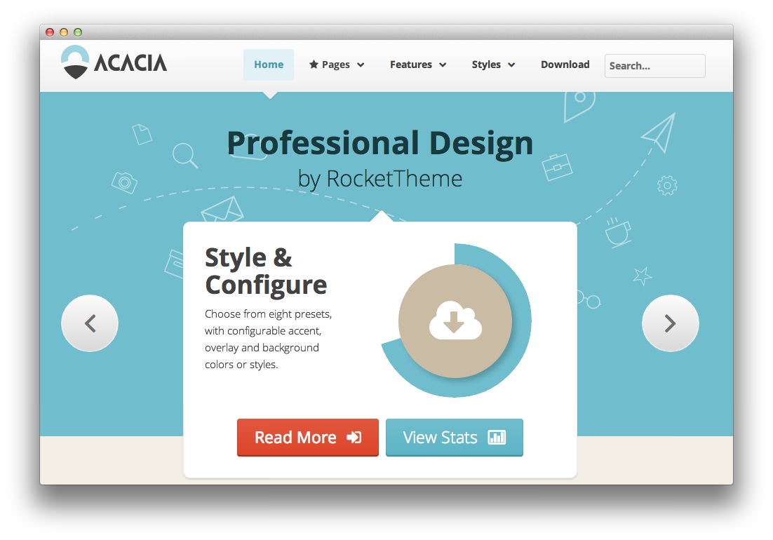
Acacia is a beautifully designed professional template, presenting exquisite HTML5 canvas charts, alongside the highly configurable preset style variations, and splendid iconography.
The template is built with the Gantry 4 Framework, which provides many features such as an advanced administrator, alongside other features such as integrated RokSprocket styling and a Dropdown CSS menu system.
NOTICE: Acacia is a Joomla 3.x Template.
Requirements
- Apache 2.2+ or Microsoft IIS 7
- PHP 5.3.10+ (PHP 5.5+ Recommended)
- MySQL 5.1+
- Joomla 3.4
NOTE: Gantry v4.1.35 is required for Acacia to work correctly. For more details on the Gantry Framework, please visit its dedicated website.
Key Features
- Joomla 3.x Compatible
- Responsive Layout
- 8 Preset Styles
- 88 Module Positions
- 8 Styled & Numerous Structural Module Suffixes
- RokSprocket Integrated Styling
- Optimized for RokBooster
- HTML5 Canvas Charts
- Powerful Gantry 4 Framework
- DropDown Menu & Splitmenu
- Custom Content Typography
- FF, Safari, Chrome, Opera, IE8+ Compatible
- HTML5, CSS3, LESS CSS
Responsive Layout
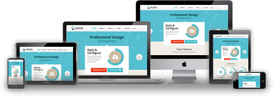
Acacia's responsive grid system is designed for desktop, tablet and smartphone systems, each with minor modifications to ensure compatibility in each mode.
The table below shows the breakdown of screen resolutions and associated devices, and which layout characters are then applied to each.
| Label | Description | Layout Width | Column Width |
|---|---|---|---|
| Smartphones | Standard smartphones | 480px and below | 100% fluid |
| Smartphones to Tablets | Larger smartphones and small tablets | 767px and below | 100% fluid |
| Tablets | Larger tablets | 768px and above | 64px |
| Desktop | Standard desktops and laptops | 960px and above | 80px |
| Large Display | Large desktops and high-resolution laptops | 1200px and above | 100px |
HTML5 Canvas Charts
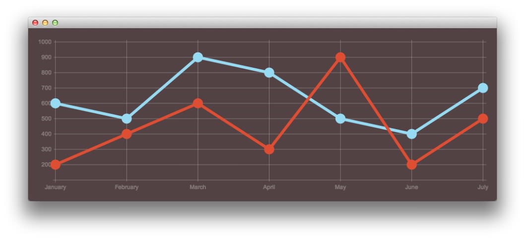
Acacia uses Chart.js and HTML5 canvas to display beautiful graphs and exquisite typography, such as the various icon elements used on the demo.
This feature may not function properly for users of IE8 and older browsers.
Responsive Layout for RokSprocket
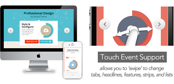
Acacia comes with integrated styling for the RokSprocket extension, which is built with a responsive layout and support mobile touch events, such as 'swipe'.