RokGallery: Module Guide
Your Guide to Setting Up and Using RokGallery Modules for Joomla
Creating a Module
Creating a RokGallery module is a fairly straightforward process. You Would create it as you would any other module by navigating to Administrator -> Extensions -> Module Manager and selecting the green New button in the upper-left region of the page.
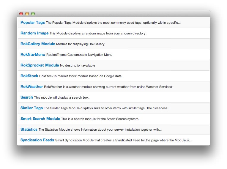
Once there, you will be asked which type of module you wish to create. RokGallery has its own module type listed as RokGallery Module. Simply select that from the list (pictured above) and you can begin initial configuration.
Module Configuration
Details
-
 1TitleThis is the title of your module.2Show TitleDetermines whether the title of the module will appear for visitors or remain hidden.3PositionSets the publishing status for the module.4StatusDetermines the publishing status of the module.5AccessSets the access level for the module.6OrderingSets the ordering for the module.7Start PublishingDetermines when the module should be published on your site.8Finish PublishingSets an end date/time for your module to appear on the frontend.9LanguageAllows you to pick a language for your module. This list is determined by the supported languages installed on your Joomla site.10NoteA place to jot down a note which appears in the module list on the backend.
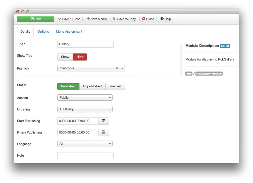
The Title field gives you the ability to set a title for the module itself. Every module has to have a title, though you can opt to hide it from public view for a cleaner, more template integrated look.
The Show Title option gives you the ability to determine whether or not the title of the module will appear with the module on the frontend.
The Position option allows you to determine where in your layout the module will appear.
Status option allows you to determine the current publishing status of the module. An unpublished module will still appear on the backend for administrators, but will not appear on the live site.
The Access option gives you the ability to determine which user group will be able to see the module on the frontend. Someone logged in as a registered user may be able to see a module set at that level while random visitors do not see it.
Ordering gives you the ability to set the ordering for the module.
Start Publishing determines the start date/time when the module should be published on your site.
You can use Finish Publishing to set an end date/time for your module to appear on the frontend.
Language allows you to pick a language for your module. This list is determined by the supported languages installed on your Joomla site.
You can use the Note field to jot down a note which appears in the module list on the backend.
Basic
-
 1GalleryThis option allows you to assign a RokGallery tag gallery to the module. Images with tags matching that of this gallery are displayed with the gallery's image preferences.2Link TypeThis option sets the action resulting from clicking the image in the gallery. You can set it to work with RokBox or RokBox2, a link determined by the slice settings of the image, the full image, or do nothing at all.3Default Linked ItemIf you have selected Link in Slice and you have not set a link within the slice, this will be the link the gallery defaults to.4Show TitleThis option sets whether or not the title of a slice is shown in the gallery.5Show CaptionThis option sets whether or not the caption of a slice appears in the gallery.6Sort ByThis option sets the default sorting order for images in the gallery.7Sort DirectionYou can choose to have items sorted in ascending or descending order based on the Sort By setting.8Slice LimitYou can set the limit of slices which appear in the gallery.9Gallery StyleThis option allows you to choose from a light or dark gallery style, affecting the look of the gallery within the module.10Gallery LayoutGalleries can be laid out in a Grid, Slideshow, or Showcase pattern.
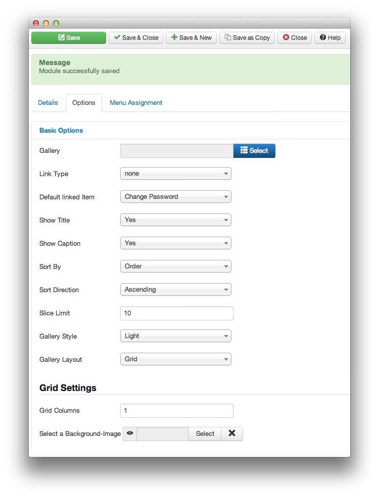
Gallery: This option allows you to assign a RokGallery tag gallery to the module. Images with tags matching that of this gallery are displayed with the gallery's image preferences.
Link Type: This option sets the action resulting from clicking the image in the gallery. You can set it to work with RokBox or RokBox2, a link determined by the slice settings of the image, the full image, or do nothing at all.
Default Linked Item: If you have selected Link in Slice and you have not set a link within the slice, this will be the link the gallery defaults to.
Show Title: This option sets whether or not the title of a slice is shown in the gallery.
Show Caption: This option sets whether or not the caption of a slice appears in the gallery.
Sort By: This option sets the default sorting order for images in the gallery.
Sort Direction: You can choose to have items sorted in ascending or descending order based on the Sort By setting.
Slice Limit: You can set the limit of slices which appear in the gallery.
Gallery Style: This option allows you to choose from a light or dark gallery style, affecting the look of the gallery within the module.
Gallery Layout: Galleries can be laid out in a Grid, Slideshow, or Showcase pattern.
Each layout option comes with one or more specific settings. These settings appear at the bottom of the Basic module options, depending on which Gallery Layout you have selected.
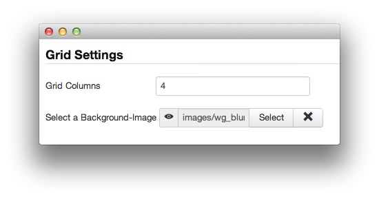
For example, the Grid layout allows you the option to choose how many columns appear in your grid, and to select a background image (if your template allows).
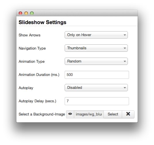
The Slideshow layout allows you to determine if you wish to show arrows on either side of the image as well as set your navigation and animation types. You can also tell it whether or not you wish slideshows to autoplay, and with what delay between images.
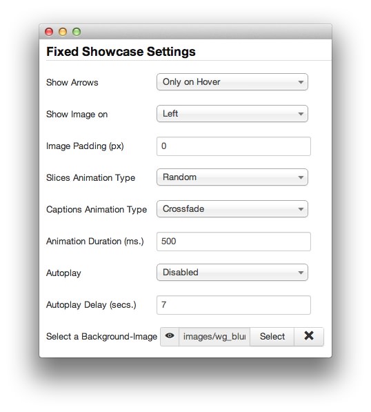
The Showcase layout works very similarly. You have the option to choose whether or not you wish to have arrows appear as a secondary navigation option, which direction the image will appear in the showcase in relation to the thumbnails, image padding, and animation options. These options remain the same for both fixed and responsive versions of the Showcase layout.
Advanced
-
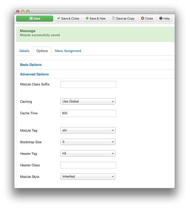 1Module Class SuffixThis is a suffix applied to the CSS class of the module. This allows for individual module styling.2CachingSelects whether or not to cache the content of this module.3Cache TimeThis option sets the time between module recaching.4Module TagThis sets the HTML tag for the module.5Bootstrap SizeThis option specifies how many columns the module will use.6Header TagThis field sets the HTML tag for the module header/title.7Header ClassThis field sets the CSS class for the module header/title.8Module StyleThis option allows for an override of the template style for its position.
Module Class Suffix: A suffix applied to the CSS class of the module. This allows for individual module styling.
Caching: Selects whether or not to cache the content of this module.
Cache Time: Sets the time between module recaching.
Module Tag: Sets the HTML tag for the module.
Bootstrap Size: Specifies how many columns the module will use.
Header Tag: Sets the HTML tag for the module header/title.
Header Class: Sets the CSS class for the module header/title.
Module Style: Allows for an override of the template style for its position.